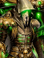
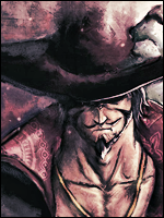
SubZero Signature

397 posts 268 reactions
Joined
Jan 31, 2012
Messages
397
Status
Activity Streak
title says it
You must be registered for see images


V2 with Text/border
You must be registered for see images

cnc
 
Last edited:
Vex

Kage in the Making 👑
Legendary
12,551 posts 519 reactions
5
Joined
Jul 18, 2012
Messages
12,551
Status
Activity Streak
Wow looks really cool. Nice job :D
 

Beastbomb

Jōnin Strategist 🧠
Regular
1,897 posts 723 reactions
3
Joined
Feb 17, 2012
Messages
1,897
Status
Activity Streak
Nice job Dracule, the only thing I would suggest is maybe a bit stronger lighting(could be my screen settings though) the left shoulder on the render is pretty bright but the lighting appears a little dull. Also some text would cap it off nicely:)
 

Toruk-Makto

Sannin of the Scrolls 📜
Elite
6,715 posts 365 reactions
2
Joined
Jul 13, 2011
Messages
6,715
Status
Activity Streak
the way you placed the c4d's really makes it look good .
the colours are great goes very well with the whole signature .
Maybe some text is missing in it .
You could have added a light source into it which could have helped in making the colours a little more bright ...

Other than this its great

^_-
 
397 posts 268 reactions
Joined
Jan 31, 2012
Messages
397
Status
Activity Streak
thanks guys :p and about text, i couldnt find good place for it.. well may be i'll try to add later
 

Beastbomb

Jōnin Strategist 🧠
Regular
1,897 posts 723 reactions
3
Joined
Feb 17, 2012
Messages
1,897
Status
Activity Streak
I'm not great with text, but if it was me I'd try lower left side somewhere.
 
397 posts 268 reactions
Joined
Jan 31, 2012
Messages
397
Status
Activity Streak
OK here's the version 2 with text and border >_< and added some lights
 

Toruk-Makto

Sannin of the Scrolls 📜
Elite
6,715 posts 365 reactions
2
Joined
Jul 13, 2011
Messages
6,715
Status
Activity Streak
Much better than previous one :)
 

Beastbomb

Jōnin Strategist 🧠
Regular
1,897 posts 723 reactions
3
Joined
Feb 17, 2012
Messages
1,897
Status
Activity Streak
Yeah v2 looks a lot better(not that v1 was bad):)
 

Drool

Member
29 posts 9 reactions
Joined
Sep 10, 2012
Messages
29
Status
Activity Streak
Do really like both. I'd only suggest that the gradient on the type is just a bit too harsh. Other than that, great.
 

Naruto UzRinneganMaki

Jōnin Strategist 🧠
Regular
1,441 posts 216 reactions
Joined
Aug 12, 2011
Messages
1,441
Status
Activity Streak
Nice color scheme and lightings, ... but u know, those texts don't really fit in and the flow is unclear (or rather messy)
 
Top