You are using an out of date browser. It may not display this or other websites correctly.
You should upgrade or use an alternative browser.
You should upgrade or use an alternative browser.
some of my latest works
- Thread starter Dracule Mihawk
- Start date
More options
Who Replied?

Dracule Mihawk
Member
- Joined
- Jan 31, 2012
- Messages
- 397
- Reaction score
- 268
wow thanks again guys i didnt know that my works will deserve this kind of ravishment
Dracule Mihawk
Member
- Joined
- Jan 31, 2012
- Messages
- 397
- Reaction score
- 268
You must be registered for see imagesWhats your secret
well, I'm human


- Joined
- Mar 14, 2012
- Messages
- 3,724
- Reaction score
- 160
wow thanks again guys i didnt know that my works will deserve this kind of ravishment
Oh course it does their amazing lol You know you can make a real killing if you worked for NB's design shop here ---->
You must be registered for see links
With how you work there would be no problem for you for them to add you to their team lol and plus you could make a lot of people happy around here U_U lol
Dracule Mihawk
Member
- Joined
- Jan 31, 2012
- Messages
- 397
- Reaction score
- 268
Oh course it does their amazing lol You know you can make a real killing if you worked for NB's design shop here ---->You must be registered for see links
With how you work there would be no problem for you for them to add you to their team lol and plus you could make a lot of people happy around here U_U lol
I just dont have time for that u know.. i'm on two other GFX forum and i'm in gfx team too.. so i participate in soome competetions and making tags, so most of my time takes those forums.. that's why i spend less time here
- Joined
- Apr 24, 2012
- Messages
- 3,192
- Reaction score
- 256
*o* The tags you made are really nice x3 I like them c:
As you asked for cnc I will try to give some
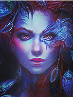
I like the first one the best though the purple light on the girl's right is a bit too hard(?) Get rid of some of the purple on the right of the girl, its too strong and anyway I noticed the light falling on her hair is yellow not purple there so probably make the purple fractal(?) yellow or rub out parts of it. I really like how everything comes together in this one.
For the second it is good too, though the use of green in the tag doesn't make sense if you get what I mean. You have to make sense out of it by making the colour transitions smooth and in harmony with the tag. Don't just dye a c4d in one colour. =/ Make the yellow change to green and probably a darker green continuing the cycle. Its the reason why the right side looks awesome but left side looks off. I am seeing a lot of gfx-ers lately who are making this mistake.
Other than that, the light source on the left seems a little like a wide green blank open space. I'm not good with open light spaces myself so I will just say how about adding a fractal or something over it yo make it look like it is really giving out light. Practise them a bit more and hopefully the next time the light soucre might come out perfect :3
Same goes for the third, the blue and purple don't fit in. I don't see the point in adding the colour if it isn't gonna relate to the rest of the tag. Try hinting the colour at other places or change the colours to yellowish orange you used everywhere. Also i suggest making the bottom of the tag less detailed as the tag looks too stuffy (try adding something black if that helps )
Overall all 3 of them look awesome though a bit too heavy but I probably like heavy tags. Keep it up ad you will do even better :3 And yes I know removing the colours ill make the tag look 'boring' So like I said try hinting the colours a bit here and there(like you did with purple in the first tag, a bit of it was every where) and avoid directly jumping from one colour to another if you can. ^^~
As you asked for cnc I will try to give some
I like the first one the best though the purple light on the girl's right is a bit too hard(?) Get rid of some of the purple on the right of the girl, its too strong and anyway I noticed the light falling on her hair is yellow not purple there so probably make the purple fractal(?) yellow or rub out parts of it. I really like how everything comes together in this one.
For the second it is good too, though the use of green in the tag doesn't make sense if you get what I mean. You have to make sense out of it by making the colour transitions smooth and in harmony with the tag. Don't just dye a c4d in one colour. =/ Make the yellow change to green and probably a darker green continuing the cycle. Its the reason why the right side looks awesome but left side looks off. I am seeing a lot of gfx-ers lately who are making this mistake.
Other than that, the light source on the left seems a little like a wide green blank open space. I'm not good with open light spaces myself so I will just say how about adding a fractal or something over it yo make it look like it is really giving out light. Practise them a bit more and hopefully the next time the light soucre might come out perfect :3
Same goes for the third, the blue and purple don't fit in. I don't see the point in adding the colour if it isn't gonna relate to the rest of the tag. Try hinting the colour at other places or change the colours to yellowish orange you used everywhere. Also i suggest making the bottom of the tag less detailed as the tag looks too stuffy (try adding something black if that helps
)Overall all 3 of them look awesome though a bit too heavy but I probably like heavy tags. Keep it up ad you will do even better :3 And yes I know removing the colours ill make the tag look 'boring' So like I said try hinting the colours a bit here and there(like you did with purple in the first tag, a bit of it was every where) and avoid directly jumping from one colour to another if you can. ^^~
Last edited:
- Joined
- May 27, 2012
- Messages
- 1,018
- Reaction score
- 47
You must be registered for see images
Dracule Mihawk
Member
- Joined
- Jan 31, 2012
- Messages
- 397
- Reaction score
- 268
*o* The tags you made are really nice x3 I like them c:
As you asked for cnc I will try to give some
I like the first one the best though the purple light on the girl's right is a bit too hard(?) Get rid of some of the purple on the right of the girl, its too strong and anyway I noticed the light falling on her hair is yellow not purple there so probably make the purple fractal(?) yellow or rub out parts of it. I really like how everything comes together in this one.
For the second it is good too, though the use of green in the tag doesn't make sense if you get what I mean. You have to make sense out of it by making the colour transitions smooth and in harmony with the tag. Don't just dye a c4d in one colour. =/ Make the yellow change to green and probably a darker green continuing the cycle. Its the reason why the right side looks awesome but left side looks off. I am seeing a lot of gfx-ers lately who are making this mistake.
Other than that, the light source on the left seems a little like a wide green blank open space. I'm not good with open light spaces myself so I will just say how about adding a fractal or something over it yo make it look like it is really giving out light. Practise them a bit more and hopefully the next time the light soucre might come out perfect :3
Same goes for the third, the blue and purple don't fit in. I don't see the point in adding the colour if it isn't gonna relate to the rest of the tag. Try hinting the colour at other places or change the colours to yellowish orange you used everywhere. Also i suggest making the bottom of the tag less detailed as the tag looks too stuffy (try adding something black if that helps
Overall all 3 of them look awesome though a bit too heavy but I probably like heavy tags. Keep it up ad you will do even better :3 And yes I know removing the colours ill make the tag look 'boring' So like I said try hinting the colours a bit here and there(like you did with purple in the first tag, a bit of it was every where) and avoid directly jumping from one colour to another if you can. ^^~
thanks for CNC .. yea i'm still practising with those and agreed about colours.. everyone said same lol