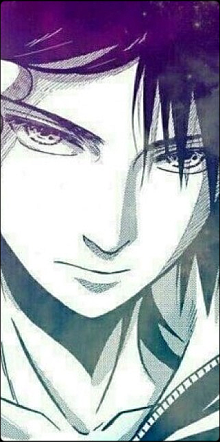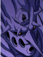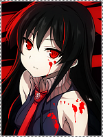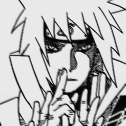
[Photoshop] some avatars

Fair Warning

Kage in the Making 👑
Legendary
Joined
Jan 18, 2013
Messages
11,453
Reaction score
922
CnC appreciated
You must be registered for see images


Renders used:

You must be registered for see images

You must be registered for see images

I used a barb wire render over Minato, and used the sponge tool to give the splatter effect on Itachi, and Obito had a gradient with around 30% opacity. I think they came out well.
 
Last edited:
Rainbow Dash

Sannin of the Scrolls 📜
Elite
Joined
Dec 9, 2012
Messages
9,702
Reaction score
1,027
Needs less Minato, and more Roy Mustang.
 

BazzBee

Kage in the Making 👑
Legendary
Joined
Mar 11, 2013
Messages
14,587
Reaction score
1,222
Not bad but i think you should try to use other borders as such as Dotted borders or atleast reduce the thickness to 1px.
The Itachi one needs more background and the Obito one could use a white border .-. the minato one is great excluding the border that is.
 

Fair Warning

Kage in the Making 👑
Legendary
Joined
Jan 18, 2013
Messages
11,453
Reaction score
922
Not bad but i think you should try to use other borders as such as Dotted borders or atleast reduce the thickness to 1px.
The Itachi one needs more background and the Obito one could use a white border .-. the minato one is great excluding the border that is.
You're picky with borders, but thanks for the advice!
 

WhistleBlower

Legendary Shinobi 🐸
Supreme
Joined
Apr 12, 2012
Messages
27,716
Reaction score
1,798
They are good bro!! There is room for improvement but they are still quite good :)
 

Zuru

Jōnin Strategist 🧠
Regular
Joined
Apr 28, 2013
Messages
1,584
Reaction score
139
Nice job man, keep up the good work. =D
 

suki

Anbu Operative 🎭
Veteran
Joined
Feb 9, 2013
Messages
4,357
Reaction score
808
They look nice. ^^
The things that are bothering me;
- The renders you've chosen are low quality, which lack in attraction ( so next time becareful of what kind of quality renders you chose! )
- The scanlines used in in the second one is overloaded, try reducing the opacity when using the scanlines.
- and last of all, watch more signature tutorials to help you with the idea of placing effects in the correct way to please attractors :)
 

Kurome

Anbu Operative 🎭
Veteran
Joined
May 6, 2013
Messages
3,276
Reaction score
382
The itachi one needs a darker background in my opinion, it's a bit too bright. Minato is ok, but if you can, shorten the border. Obito needs a border, somewhat circle-cropped at corners..
Other than these, good avas! :win:
 
Top