Hm.
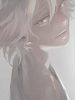
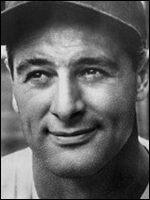
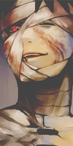
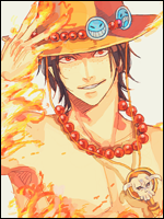
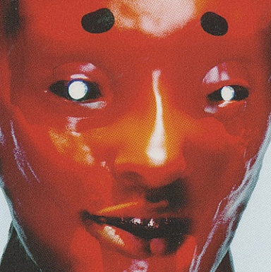
I like the first two on the left more, due to the fact they got this crisp feeling. "Problem" is that two of the avatars has this background feeling, where is in i feel avatars should have a clear focal point. Not really super fond of the style where the people involved in the signature aren't really focused too much but rather is blended towards a background. Hm..
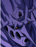
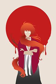
Other than that i really like the colors. Except on the last one to the right, looks slightly dull in the color aspect. Although focal wise it's the best one xD. Feels like you could've done more with that one(still talking about the one to the far right there). Looks slightly LQ tbh, and due to the overload of flowers(O___O) i feel more colors should be involved as well.
Secound to the left one is my favourite due to the fact the persons are actually quite close and creates the focal, plus the crispyness(not a word, but meh) is awesome <3.