- Joined
- Mar 30, 2011
- Messages
- 6,190
- Reaction score
- 1,102
This is probably going to be the last sig I'll post here for a few months>_> my holiday ends in a few daysT__T
Adiosxd
You must be registered for see images
Adiosxd
")
thank youCool
>_>dammit elmage,...stop making me jellous !! o-o
i wanna learn that style of sigs :T_T:
and thanks!Bueno.
the text always is>_> its a curseU__U, its like my GFX mode automatically shut down before writing textT_Tdamn...am i the only one that havent made a smudge in AGES???
Pretty good Elmage...I like how y combine stocks with smudge..the text is quite terrible though..

the text always is>_> its a curseU__U, its like my GFX mode automatically shut down before writing textT_T
 It flows smoothly (tho I didn't notice the nest till I read Chaos' post xd That irrelevant was to my eyes) xd
I'm not terrible at text>_> I just don't have any inspiration, I could be wicked with text too...when the time comesxD
Instead of text y could add a symbol...like this:You must be registered for see links
or thisYou must be registered for see links
(Pro tip for the unskilled in textxD)
What a shame! You have got really gud at gfx...xd I like to be around in this sec...and when I see a thread of yours I'm expecting something gud ;D
But oh-well...¡Hasta la vista!
Btw, what a gud smudge sig
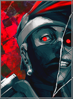
CnC's..
First off, good blending(for a smudgie, duh xd). I really like the colors, and how they kinda meet each other in black or on the render/focal. Maybe i am just an ass right now, but i'd love to see some more color going on on the focal himself :/. The tag seems very color full, but the focal itself seems kinda dead(in color perspective). . . I'd like to have some compensating C4D's or anything to help the focal look a tad better. Cause that would make the whole tag look better!
The text isn't bad, Chaos.. Don't know why you said that but i disagree. It is, however not very good placed. I'd have it right under the renders cheek. That would remove the feeling of two focals, plus it would give the render a small color boost i was talking about before.
I miss some depth here :/. Only part it is clearly showing is on the renders right hand(left in our perspective). Add more depth.. Pls O_O.
The background is great! However i want to see two things happen with it.
1. Well, the depth..
2. More action on the left corner, it looks slightly dead. However don't make anything to "stand out", remember the depth.
I also can't help but feel that his left hand(right in our perspective) isn't blended into the tag at all? Maybe that's intended, but it feels un-dynamic, considering everything else is blended pretty awesome :/..
I like the discrete light source, but i would've wanted something of it on the right side of the tag aswell, not just the left side perhaps. Maybe it is intended to light up the text, but meh. I'd not do that xd. I'd move the text under the renders cheek, and.. Well hell no don't make another lightsource >_>. Stick with one but center it more, over the render. Dat'd be nice >_O
Overall, nice job >______________________O