[Photoshop] Skyfall Sig

Pavoneo

Anbu Operative 🎭
Veteran
2,646 posts 616 reactions
1
Joined
May 1, 2012
Messages
2,646
Status
Activity Streak
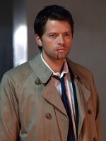
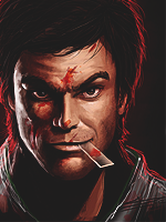
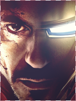
Watched the movie last night, thought I'd make a sig.

You must be registered for see images


Have to practice using real people in my sigs >_<.
Will probably change the text, cuz it sucks, along with the rest of the sig but eh :3.​
 

Netferarri

Kage in the Making 👑
Legendary
18,426 posts 521 reactions
Joined
Aug 5, 2012
Messages
18,426
Status
Activity Streak
It's pretty good
You must be registered for see images
 

China IL

Anbu Operative 🎭
Veteran
2,594 posts 275 reactions
4
Joined
Dec 19, 2012
Messages
2,594
Status
Activity Streak
The background looks poorly made before it looks blurred. Very nice though.
 

suki

Anbu Operative 🎭
Veteran
4,357 posts 808 reactions
30
Joined
Feb 9, 2013
Messages
4,357
Status
Activity Streak
The background looks poorly made before it looks blurred. Very nice though.

I don't see what you mean...
@OP: no flaws IMO, it's pretty neat. Nice work ^_^
 

-R-

Jōnin Strategist 🧠
Regular
1,419 posts 264 reactions
1
Joined
Jun 1, 2013
Messages
1,419
Status
Activity Streak
Bro ! The foreground is kinda empty, or maybe not........ Something is missing here, but I dont know what
 

-S-

Legendary Shinobi 🐸
Immortal
41,396 posts 2,409 reactions
14
Joined
Jan 16, 2011
Messages
41,396
Status
Activity Streak
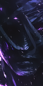
I don't think it was necessary to put those C4Ds behind his head, since they don't blend well and look a bit LQ.

Text is nice, and the grey-scale theme is good.
 

TheLastSamurai

Anbu Operative 🎭
Veteran
4,521 posts 295 reactions
1
Joined
Dec 29, 2011
Messages
4,521
Status
Activity Streak
The sides look way to overblurred?
 

Pavoneo

Anbu Operative 🎭
Veteran
2,646 posts 616 reactions
1
Joined
May 1, 2012
Messages
2,646
Status
Activity Streak
I don't think it was necessary to put those C4Ds behind his head, since they don't blend well and look a bit LQ.

Text is nice, and the grey-scale theme is good.
Without the C4D behind his head, it looked really really really empty x_x.
The sides look way to overblurred?
Err. Right side I could agree, not so much the left.
 

Hei

Supreme
23,898 posts 1,602 reactions
23
Joined
Aug 22, 2011
Messages
23,898
Status
Activity Streak
Real life renders are hard to work with anyway the signature is ok,not fond of b/w style but i guess it's better that way
 

-S-

Legendary Shinobi 🐸
Immortal
41,396 posts 2,409 reactions
14
Joined
Jan 16, 2011
Messages
41,396
Status
Activity Streak
Without the C4D behind his head, it looked really really really empty x_x.

But remember, it's a design, forget about having to add C4Ds here and there just for a moment. The fact that it feels empty behind his head, through the spiral, is meant to be whole concept.
 
Top