Since everybody else is making tags >.>
- Thread starter Fex
- Start date
More options
Who Replied?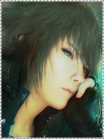


Awards


Good work ^.^
Thanks Hotaro :"]
The unsharp segment is a really nice idea, and I like the general work on it. Great work man.
Thanks Six Paths, a lot of people told me that this was my best tag up to date.
sick color bros sign is hoo ee tt
Red And Blue are my favorite colors.
That is really awesome
The mangas you read are awesome
Awards
Thanks Six Paths, a lot of people told me that this was my best tag up to date.
It's amazing...Though if I may suggest some small things. Why does only the left side has a black banner? Kinda loses the feel of symmetry. The other thing would be that this unsharp segments has borders of his own, a while glow border maybe. So...I would have suggested to eliminate it on the upper and lower ends.
Though, this is all just preference wise. Once again, sick work^^.
beauty. simply a beauty. +rep
Thank you,thank you my kind sir.
It's amazing...Though if I may suggest some small things. Why does only the left side has a black banner? Kinda loses the feel of symmetry. The other thing would be that this unsharp segments has borders of his own, a while glow border maybe. So...I would have suggested to eliminate it on the upper and lower ends. Though, this is all just preference wise. Once again, sick work^^.
Funny thing is that I had the same problems with the tag but I was like whatever to take out the black border and adjust the glow.
Last edited:

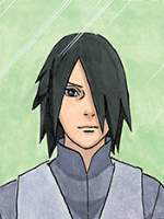
Definitely liking the composition and idea behind it. It could use more work to it, however. The text, both font choice and colours do not fit at all. You need to work on depth as well, and the left side seems a bit empty aside from the red light source. Also, there's a white light source on top of her head that comes from nowhere? Should get that fixed.
Definitely liking the composition and idea behind it. It could use more work to it, however. The text, both font choice and colours do not fit at all. You need to work on depth as well, and the left side seems a bit empty aside from the red light source. Also, there's a white light source on top of her head that comes from nowhere? Should get that fixed.
Thanks!
Now, that you point out the white light source on top of her head, I notice the notice there's a red one to top right of her even though the light is blue on the c4d. I should always revise my sigs before I post them/finish them especially the renders and lighting.
Now, that you point out the white light source on top of her head, I notice the notice there's a red one to top right of her even though the light is blue on the c4d. I should always revise my sigs before I post them/finish them especially the renders and lighting.

Awards


I'm happy to see more tags here.
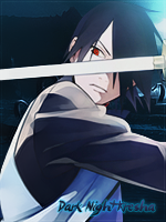
Great work! the text could have been better, and the cool blur effect crossing from top right to bottom left shouldn't have had a closed out-line. But great composition and tag overall. Keep it up.
Great work! the text could have been better, and the cool blur effect crossing from top right to bottom left shouldn't have had a closed out-line. But great composition and tag overall. Keep it up.
I'm happy to see more tags here.
Great work! the text could have been better, and the cool blur effect crossing from top right to bottom left shouldn't have had a closed out-line. But great composition and tag overall. Keep it up.
Thanks Nef ")


