You are using an out of date browser. It may not display this or other websites correctly.
You should upgrade or use an alternative browser.
You should upgrade or use an alternative browser.
Signatures ._. ._.
- Thread starter -R-
- Start date
More options
Who Replied?
- Joined
- May 20, 2011
- Messages
- 2,720
- Reaction score
- 197
Madara one is really good.Nice one.=D

- Joined
- Feb 10, 2012
- Messages
- 9,529
- Reaction score
- 1,222
Looking good ;D

- Joined
- Jun 1, 2013
- Messages
- 1,419
- Reaction score
- 264
Thank you, and my I say dat AvyThey look really good!
IMO you should try to play with different fonts, or in what position.
I like the font of the first sig. But personally I would have taken a different font for madara.
Overal very good job!


- Joined
- Jun 2, 2011
- Messages
- 4,491
- Reaction score
- 182
Well done! Zoro sig looks fantastic. Keep up the good job.
- Joined
- Jan 16, 2013
- Messages
- 4,265
- Reaction score
- 676
- Joined
- Jan 8, 2011
- Messages
- 2,749
- Reaction score
- 238
Nice work man, keep on improving them skills.

- Joined
- Feb 17, 2012
- Messages
- 1,897
- Reaction score
- 723
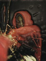
Much better than the ones you posted earlier, are you finding it easier with smaller dimensions. Anyway still some lighting and depth issues, but that will come with practice and the blue and black c4d in the Madara tag doesn't blend very well with the rest of the colours. I would try changing the blue colour in it to purple to match his eyes.

- Joined
- Feb 9, 2013
- Messages
- 4,357
- Reaction score
- 807
Ok... These are pretty good, a better improvement then the other ones. but here are things you should improve on:
1. See, the Zoro render has got some lighter shades on the right side. Putting a darker background ruins the flow of the sig as the render's lighting doesn't even match the background's expression. So choose wisely of what kinda BG is going to be placed and what kinda effects are going to be placed to allow the BG and render to blend.
2. Reduce opacity of scan lines that are placed on lighter places. For instance, there is very clear scan lines on madara's attack-fan (or whatever you call it) which doesn't look very inviting, so reducing the opacity will keep the fan clear ^^
Anyway keep on practicing
