You are using an out of date browser. It may not display this or other websites correctly.
You should upgrade or use an alternative browser.
You should upgrade or use an alternative browser.
[Photoshop] Signatures ._. ._. ._. ._. ._.
- Thread starter -R-
- Start date
More options
Who Replied?


- Joined
- May 12, 2013
- Messages
- 4,169
- Reaction score
- 433
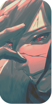
first one seems ok, but all those black lines on the second one seem to ruin the whole thing :|

- Joined
- Feb 17, 2012
- Messages
- 1,897
- Reaction score
- 723
Both have render placement issues, the first one is too far left tbh with you. I think it would be better placed in the center of the tag, that way you will get a nice flow going with his out stretched arms. The lighting is pretty intense as well, witch makes it a tad distracting, this is a personal statement but I don't like the scanlines. I think they ruin most tags, you get the odd one that looks ok but most look terrible. Also I think some better gradient maps would help a lot with the blending in the first one")
the second one is a bit better though, I think the render is a bit large as it takes up nearly the entire canvas and the one very distracting thing in here is the c4d on the right. Try not to leave edge cut offs in view as it looks really bad, again this has scanlines and I feel the same as above with these ones. The lighting is better in this one, not much else to say really as the render has left you no room to work in
Overall not a bad effort, but try to spend a bit more time on one tag rather than trying to bang them out as quick as possible, and a little more attention to detail will help as well