[Photoshop] Signatures ._. ._. ._. ._. ._. ._. ._. ._.
- Thread starter -R-
- Start date
More options
Who Replied?


Awards


I see improvement, just work more on the flow, and the size of the render.
KIU
Thank you guys ! But, which way is the flow ?Work on your flow and blending <_>
Practice makes perfect z.z
And getting better and better u.u
Will try my best Mr.Ranger !Well done sir, although I must say it could use a bit more green.


You like ? You can take. Thank you !nice sig bro i like the second,,,=D
Dat Tsuki blessing !Nice, keep on improving


Awards
thanks bro but i like fairy tail sig of mine ^_^You like ? You can take. Thank you !
!

Awards
Might as well do a bit of CnC ~_~.
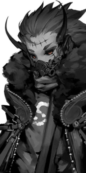
So, original reference image
First thing: Don't use backgrounds like that. Those don't fit well in signatures, especially a style you're going for (where the bg functions as a decent bit of the overall image), vector bgs like that tend to contradict C4Ds, and two overlapping styles usually cancel each other out a bit >_<. Try using real backgrounds (not real stocks, but more like digital paintings trying to paint a good scenery, that's what I use).
Flow. Well. Just look at this.
This is the flow you want.
The stance your render is in is blatantly asking for flow like that. The thing about flow is that is has to be the same throughout the whole tag (there's some times when it isn't like that, but don't worry about that for now). Just because you have flow going around the render properly doesn't mean total flow was achieved, the flow needs to keep going throughout the whole tag, this way it's easy on the eyes .-.
This is the flow you're giving off in this tag.
Really really messy >_<. It's hard to focus on one aspect because there's stuff happening in all different directions throughout the whole tag.
Other general stuff: Don't be afraid to play around with adjustment layers some more. It seems like you have due to your colours all being really similar, which is really good :3. But you can do so much more with it to give it a really nice atmosphere ~_~. Adjustment layers are what make up half the tag imo. The first half being the "core" or "raw" sig, where you have your render, bg, and C4Ds are happy and put down well, and then your second half being your adjustment layers. Your adjustment layers are what make the tag look nice, the colours are all similar and the atmosphere is brought out a lot more during this half.
Also, start darkening your edges, it helps bring up a lot more depth in your tag and makes it overall easier to make in my opinion. When doing this, KEEP IN MIND THE LIGHT SOURCE. If there's a light source coming from the right, don't darken the right side ~_~. Seems obvious but it's something that's easy to forget in practice.
Ehh.. Use different size for your canvas. I usually stay around 400-500x180-250. Those generally set up for nice sigs where it's not too vertical, too big, too small, or too wide.
If you're having issues with adjustment layers, I'd suggest downloading PSDs to see how people are using adjustment layers. Look at their gradient maps, look at the layer setting, opacity, colours, all of that. Also, you should ask yourself why they did that, and how it's affecting the sig as a whole. They may seem minor when put down individually, but when the gradient maps add up, their change in the overall appearance of the sig is tremendous o_o.
So, original reference image
You must be registered for see images
First thing: Don't use backgrounds like that. Those don't fit well in signatures, especially a style you're going for (where the bg functions as a decent bit of the overall image), vector bgs like that tend to contradict C4Ds, and two overlapping styles usually cancel each other out a bit >_<. Try using real backgrounds (not real stocks, but more like digital paintings trying to paint a good scenery, that's what I use).
Flow. Well. Just look at this.
This is the flow you want.
You must be registered for see images
The stance your render is in is blatantly asking for flow like that. The thing about flow is that is has to be the same throughout the whole tag (there's some times when it isn't like that, but don't worry about that for now). Just because you have flow going around the render properly doesn't mean total flow was achieved, the flow needs to keep going throughout the whole tag, this way it's easy on the eyes .-.
This is the flow you're giving off in this tag.
You must be registered for see images
Really really messy >_<. It's hard to focus on one aspect because there's stuff happening in all different directions throughout the whole tag.
Other general stuff: Don't be afraid to play around with adjustment layers some more. It seems like you have due to your colours all being really similar, which is really good :3. But you can do so much more with it to give it a really nice atmosphere ~_~. Adjustment layers are what make up half the tag imo. The first half being the "core" or "raw" sig, where you have your render, bg, and C4Ds are happy and put down well, and then your second half being your adjustment layers. Your adjustment layers are what make the tag look nice, the colours are all similar and the atmosphere is brought out a lot more during this half.
Also, start darkening your edges, it helps bring up a lot more depth in your tag and makes it overall easier to make in my opinion. When doing this, KEEP IN MIND THE LIGHT SOURCE. If there's a light source coming from the right, don't darken the right side ~_~. Seems obvious but it's something that's easy to forget in practice.
Ehh.. Use different size for your canvas. I usually stay around 400-500x180-250. Those generally set up for nice sigs where it's not too vertical, too big, too small, or too wide.
If you're having issues with adjustment layers, I'd suggest downloading PSDs to see how people are using adjustment layers. Look at their gradient maps, look at the layer setting, opacity, colours, all of that. Also, you should ask yourself why they did that, and how it's affecting the sig as a whole. They may seem minor when put down individually, but when the gradient maps add up, their change in the overall appearance of the sig is tremendous o_o.
You must be registered for see links
the other day for people to download. I'd suggest downloading that and downloading others to study how people use their adjustment layers and what they're doing. (I highly recommend learning to use the exposure adjustment. It's a pretty big necessity for good sigs imo.)I played around with your sig a bit and here's what I got. I'll go through each layer I put down.
I used 3 layers to darken the edges of the sig. I could darken the left and right sides because the light sources seem to be coming from the middle, so darkening edges wouldn't contradict the lighting.
Gradient Map: Dark purple/orange: screen, 10% opacity
Gradient Map: Dark purple/orange: color, 15% opacity
Gradient Map: Dark green/red: color dodge, 25% opacity
Gradient Map: Dark low saturated sky blue/light sky blue, color dodge, 15% opacity
Vibrance: -35 Vibrance/+35 Saturation
Exposure: +16/+0226/+82, normal, 79% opacity
Keep in mind that for all of these I applied the image on a new layer after each adjustment.
You must be registered for see images
I used 3 layers to darken the edges of the sig. I could darken the left and right sides because the light sources seem to be coming from the middle, so darkening edges wouldn't contradict the lighting.
Gradient Map: Dark purple/orange: screen, 10% opacity
Gradient Map: Dark purple/orange: color, 15% opacity
Gradient Map: Dark green/red: color dodge, 25% opacity
Gradient Map: Dark low saturated sky blue/light sky blue, color dodge, 15% opacity
Vibrance: -35 Vibrance/+35 Saturation
Exposure: +16/+0226/+82, normal, 79% opacity
Keep in mind that for all of these I applied the image on a new layer after each adjustment.
Last edited:

Awards
Not to offend you Pavoneo,but you only made the tag much worse. You added a lot of unnecessary adjustments. As for Future8Hokage, you're lacking pretty much everything. I'm not saying that you suck at it but you have to practice other styles and not just C4d tags. You don't have imagination on your tags because you can only do one style. Other professional tag makers has a great imagination because they switch styles every time and their brains get trained to do all this kind of stuff along the way. If you continue to do only one style, then you're going to be stuck in a shithole.
Last edited:


Awards
You must be registered for see links
You must be registered for see links
This is where I picked up a lot of techniques during my early days. Do not copy their own style but pick up bits of techniques how they do it and create your own style.
Awards
I second that U_UNot to offend you Pavoneo,but you only made the tag much worse. You added a lot of unnecessary adjustments. As for Future8Hokage, you're lacking pretty much everything. I'm not saying that you suck at it but you have to practice other styles and not just C4d tags. You don't have imagination on your tags because you can only do one style. Other professional tag makers has a great imagination because they switch styles every time and their brains get trained to do all this kind of stuff along the way. If you continue to do only one style, then you're going to be stuck in a shithole.
@Pavoneo, i think you somehow offended Future8Hokage by editing his sig, i don't know why, but i wouldn't like other people to add stuff to my sigs, CnC would'v been enough.
Awards
Meh, people edit my sigs a lot when I was trying to get better and it helped me improve a lot more. I'd always be like "Yeah, but that doesn't really apply to this tag" and someone would edit my tag and show me that it does apply. But it's whatever, I probably shouldn't edit without permission. Sorry :\.I second that U_U
@Pavoneo, i think you somehow offended Future8Hokage by editing his sig, i don't know why, but i wouldn't like other people to add stuff to my sigs, CnC would'v been enough.