You are using an out of date browser. It may not display this or other websites correctly.
You should upgrade or use an alternative browser.
You should upgrade or use an alternative browser.
[Photoshop] Signatures ._. ._. ._. ._. ._. ._. ._. ._.
- Thread starter -R-
- Start date
More options
Who Replied?

- Joined
- Nov 7, 2012
- Messages
- 38,233
- Reaction score
- 3,030
OH my Fcking amazingness nesss
i'm Very! very! proud. student Future8Hokage
You must be registered for see images
i'm Very! very! proud. student Future8Hokage
You must be registered for see images
- Joined
- Oct 2, 2011
- Messages
- 18,911
- Reaction score
- 1,663
I like them.

9YELLOW FLASH
Member
- Joined
- May 24, 2012
- Messages
- 496
- Reaction score
- 43
Awesome. Great work man.

- Joined
- Jun 1, 2013
- Messages
- 1,419
- Reaction score
- 264
Thank you Solo Master.OH my Fcking amazingness nesssYou must be registered for see images
i'm Very! very! proud. student Future8HokageYou must be registered for see images

- Joined
- Jun 1, 2013
- Messages
- 1,419
- Reaction score
- 264
Ty bro.nice work bro


- Joined
- Apr 21, 2012
- Messages
- 16,406
- Reaction score
- 742
1st one is great. font kinda sucks though =/
But overall great job. Spiderman!!
But overall great job. Spiderman!!


- Joined
- May 1, 2012
- Messages
- 2,646
- Reaction score
- 616
First one's nice. Darken the right side some more and it would look better. It would've looked better with some added adjustment layers in my opinion, right side's a little messy too >.<.. I wonder where the inspiration from that first one came from xD..

- Joined
- Jun 1, 2013
- Messages
- 1,419
- Reaction score
- 264
A tut XD !!!!!!!First one's nice. Darken the right side some more and it would look better. It would've looked better with some added adjustment layers in my opinion, right side's a little messy too >.<.. I wonder where the inspiration from that first one came from xD..
- Joined
- May 1, 2012
- Messages
- 2,646
- Reaction score
- 616
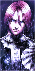
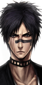
You could make some great tags, it's just that you're not putting some adjustment layers over your product. The adjustment layers are what make a tag from good to great in my opinion. You have some pretty good "raw" product in my opinion, and with some adjustments it could be a really solid tag.
Take your first tag for example, I put some adjustment layers over it to try to make it look better.
Take your first tag for example, I put some adjustment layers over it to try to make it look better.
Yours
Mine
Feel free to ask questions if you need help or want tips.
You must be registered for see images
Mine
You must be registered for see images
Feel free to ask questions if you need help or want tips.

- Joined
- Mar 7, 2012
- Messages
- 15,610
- Reaction score
- 495
I like the spiderman one
Nice job
Nice job