You are using an out of date browser. It may not display this or other websites correctly.
You should upgrade or use an alternative browser.
You should upgrade or use an alternative browser.
Signature...
- Thread starter Wanheda
- Start date
More options
Who Replied?
- Joined
- Jan 25, 2013
- Messages
- 5,381
- Reaction score
- 199
I might add text in my next sig.Its good, just put some text there and it'll be perfect cuz without it that looks empty


- Joined
- Apr 3, 2014
- Messages
- 1,743
- Reaction score
- 83
Mine is better XD
Edit: Nice work bruh! Keep it up *_*
Edit: Nice work bruh! Keep it up *_*
- Joined
- Jan 25, 2013
- Messages
- 5,381
- Reaction score
- 199
dont u get the aizen virus >.>Your current sig looks the best though.
lol thanks ur sig is just nasty.Mine is better XD
Edit: Nice work bruh! Keep it up *_*

- Joined
- Mar 27, 2014
- Messages
- 12,929
- Reaction score
- 834
dont u get the aizen virus >.>
lol thanks ur sig is just nasty.
Already surrendered.


- Joined
- Jan 25, 2013
- Messages
- 5,381
- Reaction score
- 199
Everyone's a critic. >.< I think it has a plenty of depth.
Its nice, but I don't really see a lot of depth. Though the colors are really nice and it doesn't really need a text... :L


- Joined
- Jan 25, 2013
- Messages
- 5,381
- Reaction score
- 199
:3 im making another tag today so ill see :3It looks good. I think it's just missing some more detail. Try adding some more effects next time so the black areas aren't too empty.


- Joined
- Aug 22, 2011
- Messages
- 23,898
- Reaction score
- 1,601
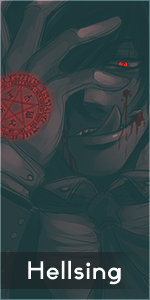
Hmm something interestin at least,let's see:
I think the tags lacks colors in general,C4D doesn't complement really well with the render.
Next is flow.It's kinda messy IMO but not bad at all,you showed good usage of c4ds,you need just more practice.
And finally,the bottom is too dark.Soft black brush doesn't create much depth,it's good for darkening yeah but you totally overdid it under the render.
Personally,i'd love to see second version with the text~ I know not everyone is good at putting text into tags but it's worth trying~
All in all,very nice tag.Look forward to see more works from you^^
- Joined
- Jan 25, 2013
- Messages
- 5,381
- Reaction score
- 199
Thanks Hei. Yea I overdid it with the bottom part lool.Hmm something interestin at least,let's see:
I think the tags lacks colors in general,C4D doesn't complement really well with the render.
Next is flow.It's kinda messy IMO but not bad at all,you showed good usage of c4ds,you need just more practice.
And finally,the bottom is too dark.Soft black brush doesn't create much depth,it's good for darkening yeah but you totally overdid it under the render.
Personally,i'd love to see second version with the text~ I know not everyone is good at putting text into tags but it's worth trying~
All in all,very nice tag.Look forward to see more works from you^^