[Photoshop] signature

Marcuss

Jōnin Strategist 🧠
Regular
Joined
May 2, 2012
Messages
1,487
Reaction score
146
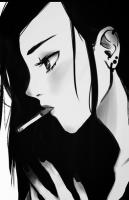
so i decided to stuff around and came up with this i am not sure if i like it or not
You must be registered for see images

please let me know what you think

with extra lines removed
You must be registered for see images


with hair full
You must be registered for see images


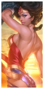
yellow bars on left fixed
You must be registered for see images


man pop outs a bit harder then i thought oh well you learn as you go a long not bad for a 1st one though
 
Last edited:

UchihaxSenju

Jōnin Strategist 🧠
Regular
Joined
Apr 27, 2012
Messages
1,243
Reaction score
110
my only complaint is probably those red things sticking out, they dont match whats inside
 

Marcuss

Jōnin Strategist 🧠
Regular
Joined
May 2, 2012
Messages
1,487
Reaction score
146
I like it, it's very nice.
Good job!
+rep
thanks

my only complaint is probably those red things sticking out, they dont match whats inside
yeah the way i have it done they are a bit lighter their only just xD

this better
You must be registered for see images
 
Last edited:

KAGE RYUU

Banned
Elite
Joined
Jan 3, 2012
Messages
5,189
Reaction score
754
looks good but the thing about pop out and air sigs...there should never be any cut off shown in the finished product like you see those yellow lines that come of the left side and hit the cut off it would look better is you couldn't tell it cut off
 

Marcuss

Jōnin Strategist 🧠
Regular
Joined
May 2, 2012
Messages
1,487
Reaction score
146
looks good but the thing about pop out and air sigs...there should never be any cut off shown in the finished product like you see those yellow lines that come of the left side and hit the cut off it would look better is you couldn't tell it cut off

this good?
You must be registered for see images
 
Last edited:

KAGE RYUU

Banned
Elite
Joined
Jan 3, 2012
Messages
5,189
Reaction score
754
this good?
You must be registered for see images

looks much better but the cut off at the bottom you can still see it should look like this

You must be registered for see images


see how it looks like the body disappears behind the border and no cut offs can be seen....this is jus my opinion tho im not really a great gfxer but again def looks better now
 

Marcuss

Jōnin Strategist 🧠
Regular
Joined
May 2, 2012
Messages
1,487
Reaction score
146
looks much better but the cut off at the bottom you can still see it should look like this

You must be registered for see images


see how it looks like the body disappears behind the border and no cut offs can be seen....this is jus my opinion tho im not really a great gfxer but again def looks better now

ok thanks ill remember that next time this was my 1st pop out seems i needed to consider more then i knew but thanks for the advice

and thank you to everyone else who has given my advise on this
 
Top