- Joined
- Sep 26, 2012
- Messages
- 12,510
- Reaction score
- 418
Any opinions:
You must be registered for see images

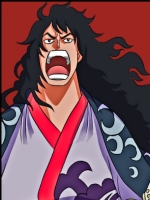
1. Agent 47 is the silent assassin, so darkness and emptiness is a part of his awesome life xd.looks empty on the top left area
and the text is bad..O_O.. i see no blending to it..
the effects look nice though :y
good job :y
i think its ur best sig so far xd


umm...1. Agent 47 is the silent assassin, so darkness and emptiness is a part of his awesome life xd.
2. the text is blended, i just decreased the opacity, because the name is just a trade mark
3.thanks
6.thanks
7.that's my opinion 2 xd
umm...
u skipped 4 and 5 >.>
and ok..then
1. then it looks good xD
2. by blending i mean..like add a small flare to it..so that it "blends in " with the flamy looking effect U_U..
but text is tough though xD im still pretty bad at it..:crazy:
1.that light is an important part of this sig.too light also why dont you put it on the middle?

ok i'm gonna challenge you:not bad with effects, your lighting needs work, text is shotty, and there isnt a lot of blend.
theres a little depth but because uve left parts black you cant really look that deep into it.
colours are aweful though, just my opinion,
better than ur last tho
 . You could also try different render positions like having it at the center or almost on the center so it doesn't seem as empty.