[Gimp] Signature Attempt
- Thread starter Luminous
- Start date
More options
Who Replied?


Awards

Awards

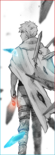
Thanks and nope, it isn't my work.Nice work, I suppose the avy is yours too ?
It was made by Sikk. =D
Awards
Oh, alrighty then.Thanks and nope, it isn't my work.
It was made by Sikk. =D

Awards


It's still pretty attracting even though the tone is messed up 
i hope this wont hurt your feelings but... I mean there is a little too much effects added to the sig that it lost balance off of the background and made it look like a messy sig. Remember, try to always keep the blend with the background, the render and the effects in an equal balance *_*
But like I said, it's still pretty attracting so keep it up *_*