[Photoshop] Scorpion Tag ._.
- Thread starter -R-
- Start date
More options
Who Replied?


The background or the character could use a little more yellow imo I don't mean more of the shade you have I mean a brighter yellow sort of like his original yellow looked.


Awards

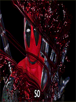
Not bad but if you are going to use orbs like that, then the lighting needs to match the intensity of those orbs. There should be a lot more lighting on the render than what there is, I think the text needs a different font and the placement needs attention as well. Try adding more adjustment layers to help with the blending, other than that and what Pavoneo said its a good effort KIU")