You are using an out of date browser. It may not display this or other websites correctly.
You should upgrade or use an alternative browser.
You should upgrade or use an alternative browser.
[Gimp] Sasuke Sig
- Thread starter Prithik
- Start date
More options
Who Replied?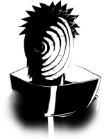

- Joined
- Mar 15, 2012
- Messages
- 3,726
- Reaction score
- 690
This is a typical beginner mistake, the canvas size is a bit too big and as a result there is a lot of space which you had to fill.You did a gret job at the blending of the render, but the render ain't the focal point anymore. When you look at the sig without focussing on Sasuke, my attention goes towards the effects. I don't know if you are familiar with the concept of flow, but this is may be a great signature to explain what it is.
Flow is essentially the direction which your attention goes to when looking at something. Before I continue the CnC, I ask you to look at your own signature without paying any attention to any part in particular and tell me where your attention is going to (so youhave to forget that this signature is all about Sasuke).
Flow is essentially the direction which your attention goes to when looking at something. Before I continue the CnC, I ask you to look at your own signature without paying any attention to any part in particular and tell me where your attention is going to (so youhave to forget that this signature is all about Sasuke).
- Joined
- Mar 15, 2012
- Messages
- 3,726
- Reaction score
- 690
Yep indeed and not to Sasuke, when yuo look at the effects, you see that they end in the middle and not at where Sasuke is. On the other hand if you had placed the effects more to the right, the left half of the sig would be pretty empty. This is a good example of how the render choice actually messed up the signature before you even started. IMO this render is too tall for a horizontal signature and not wide enough for a vertical one. I see a lot of people using this render and not one turned out well. So my advice would be learn to spot when a render is suited to work with and when not.the mid part?
Also since you are new to this, use easier to work with canvas sizes like 400*175-400*200, that way it is quite easy to spot which renders are usable.

- Joined
- Jun 26, 2014
- Messages
- 3,546
- Reaction score
- 234
Do Titania Erza GFX Classes exist? I'd totally join.

- Joined
- May 16, 2014
- Messages
- 20,732
- Reaction score
- 683
Good job
You are improving .
You are improving .