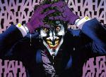
[Photoshop] Sasuke Despair [-Sig-]

Megatolium

Anbu Operative 🎭
Veteran
Joined
May 4, 2012
Messages
3,168
Reaction score
416
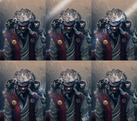
Experiment with wording, what do you think?

You must be registered for see images


CnC plz

Edit:

Fixed, removed border and me name ;( lol
 
Last edited:

Gerkak

Kage in the Making 👑
Legendary
Joined
Apr 11, 2012
Messages
16,382
Reaction score
1,192
nice.......
 

Saikyokami

Kage in the Making 👑
Legendary
Joined
Dec 11, 2012
Messages
16,811
Reaction score
943
would be better if you didn't add your name at the bottom U_U
 
Last edited:

Megatolium

Anbu Operative 🎭
Veteran
Joined
May 4, 2012
Messages
3,168
Reaction score
416
What if a premium user changes their name into ~Megatolium~?

Then they can take it quite easily.

That wouldnt work considering the fact this isnt the only website I post it to. Plus Date/Time of the post.
 

WhistleBlower

Legendary Shinobi 🐸
Supreme
Joined
Apr 12, 2012
Messages
27,716
Reaction score
1,798
Its pretty good mate!! Better than what i can do aha
 

chad062388

Anbu Operative 🎭
Veteran
Joined
Jan 8, 2011
Messages
2,749
Reaction score
238
Not bad but that border doesn't fit it at all
 

~Puppet Master~

Sannin of the Scrolls 📜
Elite
Joined
Jul 16, 2012
Messages
5,504
Reaction score
786
It's not bad at all, although your name kinda does ruin it.
Have you tried adding white text with little opacity? Like a watermark.

EDIT: Also, putting your name over a completely blue area makes it very easy to remove, making it pointless.
 

Blunt

Anbu Operative 🎭
Veteran
Joined
Oct 28, 2011
Messages
4,498
Reaction score
371
Just saying, people can just crop that out. Copy the identical looking area out right above the name and there you go, signature without your name in it.

On topic though, it is decent.
 

suki

Anbu Operative 🎭
Veteran
Joined
Feb 9, 2013
Messages
4,357
Reaction score
808
Not something I'd consider taking, but maybe for others it's a pretty good piece.
Anyhow, the horizontal scan lines is too clear, maybe reducing the opacity would do. The BG doesn't really fit the render, and there is no flow between them. Though the text is pretty good ^^
 
Top