Not bad, but to me the render looks LQ and that alone will set you up for a low quality tag when finished let me CnC this skorm styles
")
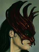
1) Render- it looks LQ as in it looks blurry and it has dull colors, try to use a render that is clean and crisp and that has nice coloring to it. That will set you up on the right foot from the start.
2) Dimensions- the size you have now is pretty big, and I'm guessing you like large tags. But to begin with try using dimensions of 400x200 or there abouts, its much easier to work with as you have less space to fill up. Then once you have the hang of those dimensions you will have no troubles going larger.
3)Lighting- this is a basic in any sig, take a look at your render and see where the light hits it. With the one you have used a lightsource should be placed above his head on the right side of the tag. There are several ways to create a lightsource, but the most basic is a soft brush around 200px, choose the correct color to match the lighting on the render then play with opacity. Try to make it as realistic as possible you should also play with blending modes like screen,color/linear dodge also soft light can work too.
4) C4d's- when using c4d's try to remember that you don't need to use the whole thing, try resizing it and move it around your canvas till you find a good spot. Then erase any parts that don't look good, as you can always add more parts of it on new layers to get a better look. You don't have to use the same one try adding other c4d's that will compliment the tag.
5)Depth- this is the one that is seriously lacking, everything is in the background therefore the tag itself looks flat. Try to add some effects in the foreground to help with the illusion that is depth. Other ways to add depth is to blur things that would appear far away and sharpen things that are close, but don't over do it or it will ruin the tag. Now a more complex way of achieving depth(I think this is the best look) is to use lighting and shading, this is where your dodge/burn tool will come to the fore. Again though don't over do it.
Well this is all I could come up with at this point in time I hope it helps you get better in some way
I'm sure Skorm could add to this.