[Photoshop] Rock Lee
- Thread starter Ushiro
- Start date
More options
Who Replied?


Awards


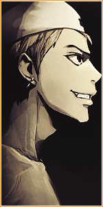
I like it but the thing there beneath Screw's it, but Good job if it's the first timeIts my first attempt at a pop out sig. C&c would be appreciated.How can i improve this?
You must be registered for see images
.Nocturnal, Less, Sin and the rest will Judge U_U
Awards


Top Part is getting cut off,never let that happen in a pop out,that is why you always make the actual dimensions bigger than the sig you are planning.
Next time,transparent the background,when creating a Project,simply select Transparent in the background option.
There is a color match,pop out effect is good,but the inside is too blurred and a bit empty.
I also don`t like his head,seems badly masked.
Next time,transparent the background,when creating a Project,simply select Transparent in the background option.
There is a color match,pop out effect is good,but the inside is too blurred and a bit empty.
I also don`t like his head,seems badly masked.
Awards
Thanks. I didn't feel like putting alot of time into that bottom part. xdI like it but the thing there beneath Screw's it, but Good job if it's the first time
Nocturnal, Less, Sin and the rest will Judge U_U
Thanks for the advice. The head thing was some kind of motion effect i messed up and tried to fix but left it like that.Top Part is getting cut off,never let that happen in a pop out,that is why you always make the actual dimensions bigger than the sig you are planning.
Next time,transparent the background,when creating a Project,simply select Transparent in the background option.
There is a color match,pop out effect is good,but the inside is too blurred and a bit empty.
I also don`t like his head,seems badly masked.

Awards
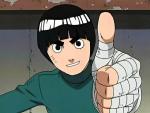
Lol, it is. Didn't you check your sig request thread? xdNice One. Looks like the render from my bio
Awards


The background seems a bit dull. And I think it may have looked better if you would have just included his right fist in the background. I think it might have emphasized the pop effect ot the nunchuk slightly better.
Awards
True, i should have used a c4d in the background and i was wondering if the fist should be in the background but if it wasn't there, it would just be a stick flying through the air unless i made the background bigger.The background seems a bit dull. And I think it may have looked better if you would have just included his right fist in the background. I think it might have emphasized the pop effect ot the nunchuk slightly better.
Thank You I absolutely forgot. Rep to youLol, it is. Didn't you check your sig request thread? xd