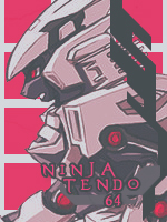
[Photoshop] Robots

Trollo Lucilfer

Kage in the Making 👑
Legendary
Joined
Sep 26, 2012
Messages
12,510
Reaction score
418
I made two versions of the same tag, i used Topaz clean in the first one, and i added Topaz detail to the second one.

You must be registered for see images


You must be registered for see images


You must be registered for see images


The7thHokage

Sannin of the Scrolls 📜
Elite
Joined
Aug 11, 2011
Messages
9,274
Reaction score
618
Nice work, weirdo.

I personally liked the v2, but I think the text will look better in a different font, but that's just my opinion, nice work !
 

NinjaTendo 64

Leaf Village Regular 🍃
Regular
Joined
Jul 25, 2012
Messages
594
Reaction score
68
Nice work pretty cool man
but i reckon you tried to over do it on your V2
& i think you should just remove that GFX other than that
its still very cool bro

:vision:
 

Beifong

Kage in the Making 👑
Legendary
Joined
Aug 25, 2011
Messages
12,662
Reaction score
546
well done megaa. but the only thing that it's Cyborg not Syborg
 

BazzBee

Kage in the Making 👑
Legendary
Joined
Mar 11, 2013
Messages
14,587
Reaction score
1,222
Not bad V2 sees better IMO and like Pain... said its Cyborg >.<
 

Virus..

Banned
Veteran
Joined
Jan 29, 2012
Messages
4,453
Reaction score
257
I don't like the style put for this sig you should use other robot render in my opinion useing as if as it was c4d but instead robot renders with same color of the main render also text horrible
 

Trollo Lucilfer

Kage in the Making 👑
Legendary
Joined
Sep 26, 2012
Messages
12,510
Reaction score
418
I don't like the style put for this sig you should use other robot render in my opinion useing as if as it was c4d but instead robot renders with same color of the main render also text horrible

That's not what a seven years experienced GFXer said :p
An advice: don't get emotional when it comes to critiques and GFXing, we're just doing this for fun *_*
 

Ushiro

Kage in the Making 👑
Legendary
Joined
Apr 23, 2010
Messages
13,005
Reaction score
260
It's great but it could use some more contrast. The text is a bit hard to see too.
 

-Carnage-

Sannin of the Scrolls 📜
Elite
Joined
Jul 4, 2012
Messages
8,222
Reaction score
661
Not bad :)
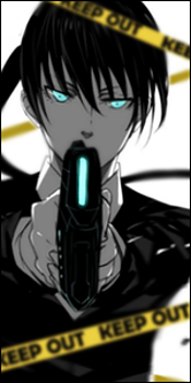
it's got potential to be badass...it just needs some minor tweaks
the lighting is tricky because of the chrome-looking background
Use curves to make the lighting pop out more, then look at the render and decide what direction the light is coming from
then use the burn tool to darken any parts that dont make sense.....if that makes sense ._.
as for depth....all you gotta do is blur the parts that look like they're farthest away...just dont over blur because that can make it lose quality
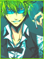
the sig is monotone...but since the render is only light blue..you have to use darker blues to make it less monotone
Or maybe even use other colors that compliment the render
as for the text...the fonts you used are pretty bad, man...using 'tron' for the "cyborg" part and 'transformer' for the "megaamine" part would've been a better choice. you can download those fonts in dafont.com btw ._.

anyways I like v.2 better :cool: KIU
 
Top