You are using an out of date browser. It may not display this or other websites correctly.
You should upgrade or use an alternative browser.
You should upgrade or use an alternative browser.
[Photoshop] Recent Avatar's Work
- Thread starter -Jiten-
- Start date
- Status
- Not open for further replies.
More options
Who Replied?

- Joined
- Jan 29, 2012
- Messages
- 927
- Reaction score
- 242
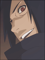
THe level between the avatars are verry inconsistent, for example Young Dante and Naruto KCM are looking decent, but there are too many brush strokes (or whatever those things are) which reduces the flow in the avatars.
Ichigo (bankai): The bg looks pretty empty, the render is bad (you can still see white around him) and the lighting is quite messed up because of that big red scanline thing.
And the rest looks way better xd
thnx for feedback. i'll keep that in mind
")
thnxI think these all look pretty cool! :3 I really like the one in the bottom right corner ^_^
very well done bro some of then are realy cool to lazy to list them xd but keeep the brightnes and contrast down
Sure bro.. thnx btw
They are awesome...0_0
thnx bhai
These are awesome
thnx bhai
Those are sick man !
hehehe really thnx
I really like it ^_^
thnx

- Joined
- Jan 29, 2012
- Messages
- 927
- Reaction score
- 242
They're alright,
feels like a render covered in fractals/backgrounds.
hehehe .. i knw i suck in backgrounds.. i need to work on this
thnx btw
- Joined
- Nov 25, 2011
- Messages
- 1,202
- Reaction score
- 111
any time brothnx for feedback. i'll keep that in mind
Sure bro.. thnx btw


- Joined
- Aug 13, 2012
- Messages
- 1,162
- Reaction score
- 134
Nice work, just one suggestion. When you add fractals make sure that aren't near areas of importance. The fractals are there to accent the main piece of work. My suggestion is that you set the layers with fractals on screen or softlight. Doing this will accent the main objective of the signature or avatar by still giving a nice crisp finishing touch. Good job!
- Joined
- Jan 29, 2012
- Messages
- 927
- Reaction score
- 242
Nice work, just one suggestion. When you add fractals make sure that aren't near areas of importance. The fractals are there to accent the main piece of work. My suggestion is that you set the layers with fractals on screen or softlight. Doing this will accent the main objective of the signature or avatar by still giving a nice crisp finishing touch. Good job!
thnx i'll keep tht in my mind
ElementNami92
Member
- Joined
- Jun 15, 2012
- Messages
- 1,848
- Reaction score
- 274
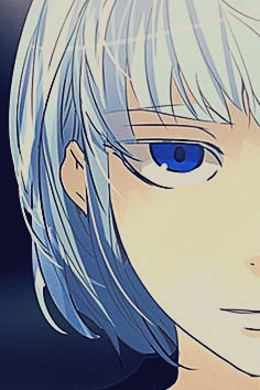
Awesome! I like pretty much all of them, My faves are the Naruto ones and the Sasuke and Ichigo ones. ^.^

- Joined
- Nov 8, 2010
- Messages
- 2,488
- Reaction score
- 228
Wow they are incredible.


GrimReaperoftheHiddenLeaf
Member
- Joined
- Mar 27, 2012
- Messages
- 1,291
- Reaction score
- 75
They are all really good, especially the bm.
Btw, guys, his most recent handiwork is in my sig the big 3
Btw, guys, his most recent handiwork is in my sig the big 3

- Joined
- May 10, 2012
- Messages
- 1,469
- Reaction score
- 327
Theyre not bad but the colours really put me off for most of them,
like theyre all really dirty looking IMO - mostly because of the lighting,
basically the concentration of lighting - and the sharpening uve done has made most of it look LQ, i personally prefer things to look smoother rather than so concentrated and sharpened
like theyre all really dirty looking IMO - mostly because of the lighting,
basically the concentration of lighting - and the sharpening uve done has made most of it look LQ, i personally prefer things to look smoother rather than so concentrated and sharpened
- Joined
- Jul 16, 2011
- Messages
- 15,960
- Reaction score
- 519
They're nice, keep up the good work. ^_^
- Joined
- Jan 29, 2012
- Messages
- 927
- Reaction score
- 242
thnx for feedback.... but i like lightining effect. So i'lll also create some avatar according to ur feedbacks.Theyre not bad but the colours really put me off for most of them,
like theyre all really dirty looking IMO - mostly because of the lighting,
basically the concentration of lighting - and the sharpening uve done has made most of it look LQ, i personally prefer things to look smoother rather than so concentrated and sharpened
They're nice, keep up the good work. ^_^
thnx
Nice Work
thnx
They are all really good, especially the bm.
Btw, guys, his most recent handiwork is in my sig the big 3
thnx
dude these are awesome!!!!! keep them coming
Sure i'll update some sigs also , i think tonyt
Most of them are really nice, some of the renders are made a little too bright to the point where you lose a lot of the definition, but otherwise really nice work.
thnx for update i'll keep that in mind
Wow they are incredible.
thnx
Awesome! I like pretty much all of them, My faves are the Naruto ones and the Sasuke and Ichigo ones. ^.^
thnx

- Joined
- Nov 25, 2010
- Messages
- 4,364
- Reaction score
- 173
its awesome

- Status
- Not open for further replies.