
You are using an out of date browser. It may not display this or other websites correctly.
You should upgrade or use an alternative browser.
You should upgrade or use an alternative browser.
[Photoshop] Protoype
- Thread starter Nara..
- Start date
More options
Who Replied?
- Joined
- Oct 27, 2010
- Messages
- 4,511
- Reaction score
- 593
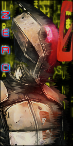
It's nice but the text seems to get in the way. How about moving it to the bottom center? That might work.
- Joined
- Aug 22, 2011
- Messages
- 3,715
- Reaction score
- 303
It's nice but the text seems to get in the way. How about moving it to the bottom center? That might work.
Like this?
You must be registered for see images



- Joined
- Sep 6, 2011
- Messages
- 535
- Reaction score
- 115
The Greatest Mistake Is That You Used More Than One Render. O_O
Never Use More Than One Render.
The Text Is "Meh".:|
There's No Blending.
Could Use Smudges.
Add Some Border.
Needs Light Source.
The Depth Is Good.
Needs Some Colors.
Never Use More Than One Render.
The Text Is "Meh".:|
There's No Blending.
Could Use Smudges.
Add Some Border.
Needs Light Source.
The Depth Is Good.
Needs Some Colors.

- Joined
- Mar 26, 2011
- Messages
- 54,373
- Reaction score
- 4,158
You shouldn't ask for thankyous cos people generally don't do it if you ask, and then they flame you and get angry :shrug:
Two said just way nicer. Don't ask for rep let your work do the talking.
---------------------------
I don't like the text at all.

- Joined
- Jun 3, 2011
- Messages
- 5,571
- Reaction score
- 444
i don't like the text
more than one render
but realy good so 6.5/10
more than one render
but realy good so 6.5/10