They are all bad. But kudos for your attempt.
Well, what did he learn from that? Nothing, kudos for that. >_>
Thanks for the comment, I'm only in it for 2 days now, In my opinion its kinda good for a noob like me lol
Don't multi post.
Alright my CnC..
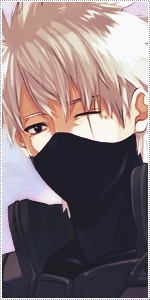
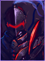
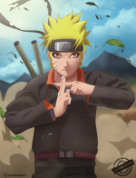
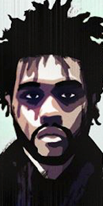
Overall, looks very messy. Colours doesn't blend together, and they feel wrong together.. Uhm, you should fix that by either make a separate lightsource, to blend the colours together more. Plus it will forward the focal point, wich obviously is your render.
Speaking of the render, i think it takes up to much space. Infact i think the canvas is to big for a signature overall. But that's just me.
Now, your render is well visible, but it doesn't blend in with the background. In these cases i'd say you should smudge it into the background, to make it blend more. Also a lightsource would blend it even further.
Now what would be nice also is depth. There is no depth, use your sharpening/blur tools. Also i recommend the burn/dodge tools for the focal. To blend the focal to match the rest of the signature.
Overall, much is going on, but in the same time not. It looks very dull in a gray-ish way. Hm. Some more different effects would be nice, like C4D's and fractals. If done right ofc, not just spread around random.
The border isn't really nice, i'd like a pitch black border, not a transparent one. It makes the focal weak in some way.. Dunno..
Version two is the best, because you can clearly see a more concentrated focusing around the focal(the render in this case).
I also would like you to try start with texts, it's a hard part. But the sooner you get started with it, the better.
So what you need to focus on is five things:
1. Matching colours
2. Blending
3. Depth
4. Flow
5. Lightning
Look up tutorials of signatures @ deviantart.com. Simply search "signature tutorial" - for inspiration and help.
Good luck!