- Joined
- Feb 17, 2012
- Messages
- 1,897
- Reaction score
- 723
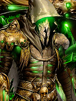
Well I just done this prince of persia sig, I think it looks ok but you guys probably have other thoughts lol any CnC would be nice cheers.
This is the sig after attempting to improve it after a few comments I hope its a bit better now at least.
This is a venom one I did before hand after reading a tut.
You must be registered for see images
This is the sig after attempting to improve it after a few comments I hope its a bit better now at least.
You must be registered for see images
This is a venom one I did before hand after reading a tut.
You must be registered for see images
Last edited: