- Joined
- Feb 8, 2013
- Messages
- 50,612
- Reaction score
- 735
Nice. Jellal one is nice...
Thanks mate.

They're all great. Nice job^^
Thanks, Cherry. :hug:

Nice. Jellal one is nice...
They're all great. Nice job^^

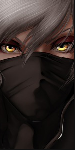
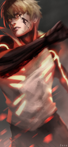
Not in the state to give a full CnC ,anyway there are few points that i want to state.
1st: Be careful with borders,all of them have the same style of a border ,which looks dull.. try few other variation.If you don't feel like it,just don't add anything,most of time it's the best solution.
2nd: don't sharpen the whole avatar,only the part that come in touch with a light or place that you want to stand out more.Sharpening tool *cough* .
3rd: I know it's a matter of taste but they are too dark.I see what you aim for ,while making them but dark parts only left an empty space,a lot of empty space.Even fractal ligts won't help to fil it ,or even make things worse like with this avatar
You must be registered for see images
You did a good job.Keep practicing,watch tutorials and i'd recommend you also start to work with other pieces of arts like signatures.It's the best way to learn more and develop your own style.

I love them. I'm taking the Law one.
first and last are flawless well done. only thing they didn't need is borders but o-well ^^
Top notch quality, good job. I collected one , hope you dont mind, if you do tell me and il take it off also i dont like the border so could make it a black border like 2mm thick or 1mm