- Joined
- Apr 2, 2011
- Messages
- 1,818
- Reaction score
- 698
Maybe that is cause we are one of the same?Finds it funny that I just saw this same thing on a different site.

Maybe that is cause we are one of the same?Finds it funny that I just saw this same thing on a different site.
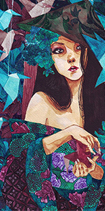
this is mostly the stock itself....u only did some lightning effects and some adjustments other than that i don't see anything extra....i know u can do better than this
1)Dont like text at all
2) it would be better if you move that light on her right little more righter
3) what is this blue thing in the bottom ?

I'll try to improve on the text and what blue thing?