I'll CnC it for you then.
First thing i noticed is the way you've seemed to used rather large focal. Or i don't know how to judge the focal, cause my eyes are traveling between the blue light on the left to the green one on the right.
The render itself isn't focused enough to create a perfect focal for my eyes to stay on. I find the colors in the bg slightly random, as none of them really are naturally occuring on the render. Pickacu's yellow , Ash's clothes are red(i think) atleast his headwear is. Should've used similar colors imo. The colors in the flow doesn't fit, simply put.
I really like the bg though, the lights are awesome. Though it gets slightly boring on the right side, there's little there. Makes it feel unnecessary and you could've made it thinner i think. Although there is some good depth in it, it feels kinda ironical since there ain't any depth on the render at all O__O. Wtf..
Blending is the weakest part in this tag. There is very little i think that makes the render blend in with the bg. This is cause there is nothing infront of the render, and it lacks depth(as i said before). There's also no lightning to blend the render with the bg.
Oh well i've highlighted some spots i'll talk more about..
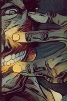
You must be registered for see images
1. Like i talked about, lightning. There should be some lightning from the bg to mix on to the render here, and i don't know if that part is supposed to be the real focal or not.. It doesn't flow well due to lightning and blending.
2. Somewhat creates a secondary focal, since it's close and central in the image. This causes more confusion about what you thought your focal really was going to be.
3. That's a pretty perfect place for you to blend Pikachu's tail with the lightning from the bg. But it's not blended there either, and that causes more flow mess.
4. I consider this part unnecessary, this tag doesn't need to be this wide.. There's barely anything on the right side anyway, and the "focal" isn't centered either.. It's on the left side. You either add some more action on that side, but do it right then. We don't want more focals, just the feeling that the tag actually continues.
With that being said it feels like the bg steals the show in the end. The render seems like you just dumped it ontop of the bg and that's it. That's a shame, cause the bg is really nice.. You need to work on;
Lightning blending
Decide a clear focal when you begin working on your tag
Depth needs to be on the render as well!
Make it feel like the tag actually continues, but not in an over-whelming way.