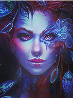
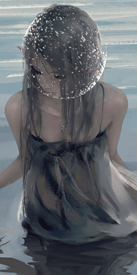
Excellent~ The first one is the best.
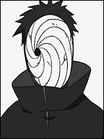
The second and last one are the best ones think I will need a new avatar soon maybe I should try my hand at something.
You must be registered for see images
win
Nefertari said:
Don't feel bad about the oversharpening lol cos it fits awesomely ^^
They look great keep it up

Thanks guys.
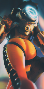
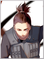
The second one is truly badass. My fav. How do you make the border like that? InThe third one im not a fan of the border tho but the render is awesome
Thank you. Well I'm sure there are several ways to make that kind of border. I use Photoshop so I basically draw the shape in and create a clipping mask on that layer.
First one to the left needs more red fractals and overall color, but through that imo. Has the best depth of all of them. Middle one is decent too but the brightest parts needs to be even brighter but without race the overall contrast to space cause the rest of the avatar is dark enough as it is. Right one is the best but yeah kinda over-sharpened. Could use some more fractals on all of the avatars and a lil better borders but they're def above the skill of average gfx:ers around here. KIU.
Actually the reason why they are all 'lacking' fractals is that none of them have any in the first place. I misused fractals in the past which made everything look low quality so I stopped using them. However, you are right. I will try experimenting with adding then once again.
I'm not sure if I agree about the brightness on the second one. But then again I won't really know until I compare 2 versions.
And as for the border, I do agree they all could be better but I ain't about that border life. It just kills me so much to give one in the first place. xD
I'll try though, hopefully.
Really appreciate all the criticism.