You are using an out of date browser. It may not display this or other websites correctly.
You should upgrade or use an alternative browser.
You should upgrade or use an alternative browser.
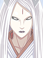
Orochimaru Avatar
- Thread starter Expulso
- Start date
More options
Who Replied?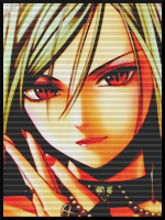
SlaySasukeHaters
Banned
- Joined
- Aug 8, 2012
- Messages
- 123
- Reaction score
- 6
can u make a sasuke one please?
- Joined
- Aug 25, 2011
- Messages
- 12,662
- Reaction score
- 546
can u make a sasuke one please?
noo other sasuke fanboy :sy:


- Joined
- Mar 14, 2012
- Messages
- 10,361
- Reaction score
- 1,368
Ok so this is the thing... I am not to experimented or so but I can give you some opinions.
First, I would've made the background something purple to match the lines on his face. It's important to keep the same chromatic.
Second, the image is not that qualitative. I know it sucks to find some good quality pics sometimes as I've had problems with that myself.
Third: the text. First, it's kinda hard to read. Always try to look for clean fonts and as well, keep the chromatic to match the whole.
This is what I can tell you from what I've learnt myself.")
First, I would've made the background something purple to match the lines on his face. It's important to keep the same chromatic.
Second, the image is not that qualitative. I know it sucks to find some good quality pics sometimes as I've had problems with that myself.
Third: the text. First, it's kinda hard to read. Always try to look for clean fonts and as well, keep the chromatic to match the whole.
This is what I can tell you from what I've learnt myself.