[Photoshop] Obey The Law =D! Please CnC My Work :)

Cascade

Active member
Regular
Joined
May 10, 2012
Messages
1,469
Kin
0💸
Kumi
0💴
Trait Points
0⚔️
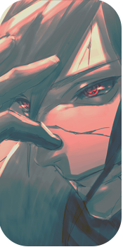
Did some work by myself, used bits and pieces from a tut but was pretty happy with it... Hope you all enjoy and leave Your CnC so i can improve for the next time :) thankyou!

ALSO a BIG thankyou to Caliburn for letting me use his render XD thankyou!!!!!!!

Textless

Text


I Look Forward To Seeing Your comments :) <3

edit: fixed the stars - c4d wasnt working as everything had already been overlaid tho
also for some reason the render didnt have a real sense of lighting so i did all of the shadowing and lighting myself through dodge n burn tools :)
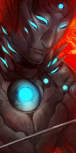
 
Last edited:

Cascade

Active member
Regular
Joined
May 10, 2012
Messages
1,469
Kin
0💸
Kumi
0💴
Trait Points
0⚔️
Its nice but it seems rather empty especially the one without text
hmm yeah, i had a c4d in it but after adding some layer effects its a lot less visable, im glad i added the fractal at the end tho..il see if i can impove the c4d and that itll look good, :)
 

Yo pappy

Active member
Elite
Joined
Oct 19, 2011
Messages
6,157
Kin
0💸
Kumi
0💴
Trait Points
0⚔️
Looks good overall. I prefer the textless one, and I like the design on the right more than the left. That gray star pattern killed it for me. ;p
 

NinjaTendo 64

Active member
Regular
Joined
Jul 25, 2012
Messages
594
Kin
0💸
Kumi
0💴
Trait Points
0⚔️
its good
but i dont like the text effect but then again everyone has the different tastes:ice: in text and sig styles uhm that render looks abit over sharpened 2 me
anyways overall i like it

edit: reading your sig sorta mind fked me ahahs
 
Last edited:

Titania Erza

Active member
Veteran
Joined
Mar 15, 2012
Messages
3,726
Kin
0💸
Kumi
0💴
Trait Points
0⚔️
Awards
If you used motionblur, you failed a little xd if you didnt used motionblur you did quite a good job foolokg me but you also did then aomething weird xd


It looks nice, not as good as the previous one xd
 

Pavoneo

Active member
Veteran
Joined
May 1, 2012
Messages
2,646
Kin
0💸
Kumi
0💴
Trait Points
0⚔️
Awards
Very very nice in my opinion.

The text is somewhat hard to read in my opinion.
Some people might complain that it's too empty, but I like it how it is.
 

SoalSlayer

Active member
Regular
Joined
Apr 30, 2010
Messages
973
Kin
0💸
Kumi
0💴
Trait Points
0⚔️
Nice indeed =] to me it feels like it needs to be blended in a little better on the left side, right side is blended perfectly just use a low opacity soft brush and erase slighly around his sword should work a treat
 

Cascade

Active member
Regular
Joined
May 10, 2012
Messages
1,469
Kin
0💸
Kumi
0💴
Trait Points
0⚔️
Nice indeed =] to me it feels like it needs to be blended in a little better on the left side, right side is blended perfectly just use a low opacity soft brush and erase slighly around his sword should work a treat
i think its a bit late, applied image so much haha but thankyou :) im glad im getting the hang of blending xD
 
Top