[Gimp] O__O more siggys

Ebi..

Sannin of the Scrolls 📜
Elite
Joined
Jan 18, 2012
Messages
8,743
Reaction score
637
and yet here again i made more siggys O_O

Sindy~
You must be registered for see images

Allan Walker~
You must be registered for see images

And i fixed this one :| Gasai Yuno ~
You must be registered for see images

Honest CnC please :shy:

 

Yuka

Sannin of the Scrolls 📜
Elite
Joined
Aug 29, 2011
Messages
6,485
Reaction score
1,056
They All Look wonderful Rep+
 

~Dream~

Anbu Operative 🎭
Veteran
Joined
Mar 13, 2012
Messages
3,324
Reaction score
398
They all suck.. nah jk all good I really like the 2nd mostly the 3rd love the blood xd
 

Rand al'Thor

Anbu Operative 🎭
Veteran
Joined
Jan 13, 2012
Messages
4,684
Reaction score
520
dont like the second one..but the others are good...
 

Naruto UzRinneganMaki

Jōnin Strategist 🧠
Regular
Joined
Aug 12, 2011
Messages
1,441
Reaction score
216
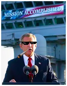
first one drop shadow makes it looks Low quality and Suck bad.

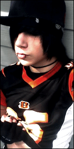
second one meh

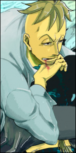
third one render looks way too dark compared to original one, and messy background. Doesn't give any impact.


so :|
 

Ebi..

Sannin of the Scrolls 📜
Elite
Joined
Jan 18, 2012
Messages
8,743
Reaction score
637
first one drop shadow makes it looks Low quality and Suck bad.

second one meh

third one render looks way too dark compared to original one, and messy background. Doesn't give any impact.


so :|

one of these days one of these days :| ill get you to say its good .__.
 

~WastelandSociety~

Sannin of the Scrolls 📜
Elite
Joined
Feb 14, 2011
Messages
5,164
Reaction score
353
I like the first and the last sig.. The 2nd one....you could do better then that.Not bad though.
 

Grim

Anbu Operative 🎭
Veteran
Joined
Feb 17, 2010
Messages
4,491
Reaction score
685
I think dropping shadow on every signature isn't good idea

1st. simply bright render and dark background - nop
2d. nothing to say, I don't like render
3d. add more depth?
 

Ebi..

Sannin of the Scrolls 📜
Elite
Joined
Jan 18, 2012
Messages
8,743
Reaction score
637
I think dropping shadow on every signature isn't good idea

1st. simply bright render and dark background - nop
2d. nothing to say, I don't like render
3d. add more depth?

yea i was trying to do that for the third one I: but couldnt find a way to do it,
thanks ^^
 

Grim

Anbu Operative 🎭
Veteran
Joined
Feb 17, 2010
Messages
4,491
Reaction score
685
yea i was trying to do that for the third one I: but couldnt find a way to do it,
thanks ^^

you can start from making some parts of the Background ''BLUR" that would do for now
 

-Yard-

Legendary Shinobi 🐸
Supreme
Joined
Jan 13, 2011
Messages
25,264
Reaction score
1,349
They're all pretty simple. And the drop shadow effect does not give them justice.
 

Ebi..

Sannin of the Scrolls 📜
Elite
Joined
Jan 18, 2012
Messages
8,743
Reaction score
637
you can start from making some parts of the Background ''BLUR" that would do for now

hmmm ill try that later on thanks, just started like 3 weeks ago so dont have that much experience at it but im hoping to learn all the basics and improve by myself
 

Genjin

Anbu Operative 🎭
Veteran
Joined
Aug 10, 2011
Messages
2,529
Reaction score
320
1st sig needs to be sharpen. :|
 

Ebi..

Sannin of the Scrolls 📜
Elite
Joined
Jan 18, 2012
Messages
8,743
Reaction score
637
O_O No it's not,it's a normal sig...
1 2 3 I don't really like,they are really messy and have no real detail.

it is O_O, i just effed it up when i put a double filtered render on the top :|
 

Mangomango

Jōnin Strategist 🧠
Regular
Joined
Mar 5, 2012
Messages
1,289
Reaction score
249
Yuno must protect Yuki!!

me likiee! +rep
 
Top