[Photoshop] Night
- Thread starter Phobos
- Start date
More options
Who Replied?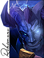

Awards

ty se zlepšuješ, hodně dobrý, asi si od tebe nechám udělat avatára 9/10
translation:
you are getting better, really good, i think i will let you make me avatar 9/10
translation:
you are getting better, really good, i think i will let you make me avatar 9/10
thanksty se zlepšuješ, hodně dobrý, asi si od tebe nechám udělat avatára 9/10
translation:
you are getting better, really good, i think i will let you make me avatar 9/10
sigy mi moc nejdou, s avatarama to docela umim, uz sem jich udelal nekolik peknych
")


Awards


Awards


I agree. There isn't much blending.The colors don't match unfortunately.


Awards


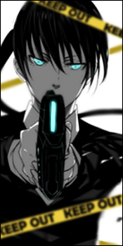
C4D kinda messy. Colour scheme is a complete fail and what worsens it is the poor blending. Now it doesn't look bad to the eye however and it's nice visually.
At-least, you tried with a 'decent' render.
6.5/10 Normally, but I'll give you 7.5 for trying something new both with C4Ds and render.
At-least, you tried with a 'decent' render.
6.5/10 Normally, but I'll give you 7.5 for trying something new both with C4Ds and render.


Blurring the C4D is to try and create depth. Everyone does it. Some not as good as others. But the second one is a bit better as the render does blend with the c4ds. sharpen the render slightly. and try to add some blue color to the left of the render, so that the blue light shines off on the rendr a bit. Try to make a light source to the left of the render and burn the right side to show a bit of lighting.If you had blended the c4d, it would've come out better. The c4d is kinda blurry too. Besides that, good work!