Awards
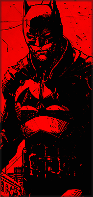
You must be registered for see images
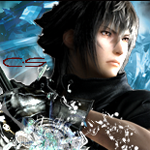
You must be registered for see images
Which one's better?
Opinion?
Criticism?
Ideas?
Last edited:

yeah it is.The picture looks kinda blurry, or is that part of the signature's design?
In any case, not bad O_O
I've changed it a bit, less blurry, better this way?The picture looks kinda blurry, or is that part of the signature's design?
In any case, not bad O_O


would have suck if I was getting worse xDYou're getting better with making the sigs now
XDDD lolwould have suck if I was getting worse xD
thk, I'll get on it right now!XDDD lol
Training makes perfection =)
That render looks blury anyway , maybe render was bad quality ...?
And sig needs a border =)
And something is missing for me in that sig...dont know , I think colors should be different , something more red , since its Uchiha
Well thats all this time , Good Luck =)
the first one is Itachi xDI like the Itachi better than the first one
thk ^^Much better =P


and a better positioning of the light sourceSo ...what we get ?
Counting all opinions ,second sig needs blending
I see you have followed the wave tut
lightings a bit messed up though, and in the 2nd one, Itachi doesn't blend with the bg =\
first: noob excuse: 8/10
second: noob excuse:7.1/10
lighting is way messed up on the second one.
The first one
the second one lacks blending
thk all!1st 1 ^_^
Better blending than the second