You are using an out of date browser. It may not display this or other websites correctly.
You should upgrade or use an alternative browser.
You should upgrade or use an alternative browser.
~new sig~
- Thread starter -Carnage-
- Start date
More options
Who Replied?
- Joined
- Sep 26, 2012
- Messages
- 12,510
- Reaction score
- 418
cool!

- Joined
- Apr 22, 2012
- Messages
- 9,831
- Reaction score
- 432
Im lovin it

- Joined
- Jul 4, 2012
- Messages
- 8,222
- Reaction score
- 661
looks dope 0_0 but I can't see the text well
yep...i always make my sigs huge when im working on them...so i forgot to resize it before i put the text on it..so when i resized it..the text looked smaller..

- Joined
- Jun 17, 2011
- Messages
- 2,956
- Reaction score
- 34
What YowYan said. It looks pretty awesome, its just the text is hard to read.
- Joined
- Jul 4, 2012
- Messages
- 8,222
- Reaction score
- 661
i agree xdoh I see... yeah The sig looks epic.... Carnage>Venom U_U
mcdonalds? xdIm lovin it
What YowYan said. It looks pretty awesome, its just the text is hard to read.
thnx.. =DD


- Joined
- Jul 4, 2012
- Messages
- 8,222
- Reaction score
- 661
ok..Looks good broskie
 ..thnx xd
looks legit brah! nice work!
thanks =DD


- Joined
- Jul 4, 2012
- Messages
- 8,222
- Reaction score
- 661
thnx nikesSweet good work
its awesome and i dont get y ppl say something bout text well i say its perfect
:ghehe: thnx... =DD
- Joined
- May 26, 2012
- Messages
- 14,626
- Reaction score
- 1,665
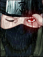
You must be registered for see images
>_O
Anyway. Time to CnC O_O, let's begin!
Alright first off i see you have kinda developed a flow.
You must be registered for see images
What bothers me though is the random lightning up to the left. Makes your eyes wander off there instead of reading the flow, wich is important that you don't do. No, focus the lighting with the flow. Don't scatter it around!
Also about the overall lighting, it's weak. It's not very uplight, and you have to make a duplicated lightning layer above the render, of the source that is behind it. Then set it to soft light, that makes the render blend in with the lighthing it has behind it. Or affects it overall.
I see you've dodge parts of his chest. Problem is you've dodge'd it too much to make it fit to the lighthing that is around him. The lighthing is weak, but the reflections are strong as.. Well STRONG O_O.. So it doesn't fit eachother..
Also, his left arm is gone.. What happend with it? It's either not in the render, or you blended it out way to much. But i suspect the secound statement.
I also find the background to random! There are some stuff that's just scattered around, you have to plan the background to make it also flow! That's why i make my bg's myself.. Way easier to follow the flow.
It looks dull, and slightly depressing tell you the truth. Boost the lightning, but not the dodged areas O_O. Lack some action too. There isn't much going on. I'd like more effects. But make sure they also follow the flow!
The white effects are to random, and stands out to much. Should also flip them a lil', they're not following the flow to good.
Also. Lack of DEEEPTH U_U. You have to make a deeper image. Sure, the render stands out. But the bg isn't blurred in any way, follow the flow with sharpness. The rest, shall be blurred.
Now, about the text. Placement is good, but could've been better. I'd personally would've liked it closer, and some parts of it above the render. Gives an even deeper impact. Unless you want the text to be behind the render ofc.
It's a good thing you've followed some kind of colour scheme and design with the rest of the picture. Problem is, that is has to many reflections. That's fine, but not if there ain't any lightsources around it. Wich there isn't in this case. So it should be duller, to fit the image. But i think the whole image needs to be brighter where the lightspots, plus a well-shaped vignette wouldn't hurt. You make vignettes by simply create a new layer above all. Use a black brush, and set the blending mode to Soft Light. Will create a more dynamic lightscheme aswell. But don't put the vignette on the focal, remember the focal has to stand out. So the vignette has to surround the flow/focal. Not be on it!
One last thing, the border needs to be thicker on large images with large focals. The bigger the image, the bigger the border. Try make borders like i've done on my signature. Those are awesome!
Meh, that's all i really have to say now..
So keep in mind til next time..
Don't make brighter reflections than the actual lightsource. If anything a reflection should even be weaker!
Depth!
Better blending with the extra effects, also make more effects. But not to much, you want a good focus. So don't scatter it around all over the place, no. You have to remember your flow. Where it goes.
You need tutorials in depth and lighting. You'll find that on deviantart.com. Hell stay there a while, try to make some awesome signatures, then find your own style. There a three common styles; Smugding(wich i suck on myself) Stock and blending(have done some of these but meh) and finally C4D style. Wich is my territory :scorps:.
Do that. Then come back O_O
- Joined
- Jul 4, 2012
- Messages
- 8,222
- Reaction score
- 661
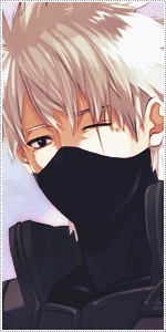
You must be registered for see images
>_O
Anyway. Time to CnC O_O, let's begin!
Alright first off i see you have kinda developed a flow.
You must be registered for see images
What bothers me though is the random lightning up to the left. Makes your eyes wander off there instead of reading the flow, wich is important that you don't do. No, focus the lighting with the flow. Don't scatter it around!
Also about the overall lighting, it's weak. It's not very uplight, and you have to make a duplicated lightning layer above the render, of the source that is behind it. Then set it to soft light, that makes the render blend in with the lighthing it has behind it. Or affects it overall.
I see you've dodge parts of his chest. Problem is you've dodge'd it too much to make it fit to the lighthing that is around him. The lighthing is weak, but the reflections are strong as.. Well STRONG O_O.. So it doesn't fit eachother..
Also, his left arm is gone.. What happend with it? It's either not in the render, or you blended it out way to much. But i suspect the secound statement.
I also find the background to random! There are some stuff that's just scattered around, you have to plan the background to make it also flow! That's why i make my bg's myself.. Way easier to follow the flow.
It looks dull, and slightly depressing tell you the truth. Boost the lightning, but not the dodged areas O_O. Lack some action too. There isn't much going on. I'd like more effects. But make sure they also follow the flow!
The white effects are to random, and stands out to much. Should also flip them a lil', they're not following the flow to good.
Also. Lack of DEEEPTH U_U. You have to make a deeper image. Sure, the render stands out. But the bg isn't blurred in any way, follow the flow with sharpness. The rest, shall be blurred.
Now, about the text. Placement is good, but could've been better. I'd personally would've liked it closer, and some parts of it above the render. Gives an even deeper impact. Unless you want the text to be behind the render ofc.
It's a good thing you've followed some kind of colour scheme and design with the rest of the picture. Problem is, that is has to many reflections. That's fine, but not if there ain't any lightsources around it. Wich there isn't in this case. So it should be duller, to fit the image. But i think the whole image needs to be brighter where the lightspots, plus a well-shaped vignette wouldn't hurt. You make vignettes by simply create a new layer above all. Use a black brush, and set the blending mode to Soft Light. Will create a more dynamic lightscheme aswell. But don't put the vignette on the focal, remember the focal has to stand out. So the vignette has to surround the flow/focal. Not be on it!
One last thing, the border needs to be thicker on large images with large focals. The bigger the image, the bigger the border. Try make borders like i've done on my signature. Those are awesome!
Meh, that's all i really have to say now..
So keep in mind til next time..
Don't make brighter reflections than the actual lightsource. If anything a reflection should even be weaker!
Depth!
Better blending with the extra effects, also make more effects. But not to much, you want a good focus. So don't scatter it around all over the place, no. You have to remember your flow. Where it goes.
You need tutorials in depth and lighting. You'll find that on deviantart.com. Hell stay there a while, try to make some awesome signatures, then find your own style. There a three common styles; Smugding(wich i suck on myself) Stock and blending(have done some of these but meh) and finally C4D style. Wich is my territory :scorps:.
Do that. Then come back O_O
***** if i can xd
ok..now i get what u mean by flow and depth..
and ill make sure to keep everything in mind xd
thnx skorm-sensei..ur the best..and im gonna put that meme as my sig..
but have i improved since the last time u gave me CNC..?
wease:EDIT: shit i cant rep u...
- Joined
- Apr 12, 2012
- Messages
- 27,716
- Reaction score
- 1,797
Its beautiful, enough said
- Joined
- May 17, 2012
- Messages
- 3,432
- Reaction score
- 503
This is awesome :y