Awards
You must be registered for see images
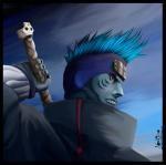
what do u think?


Not bad,but still nothign special U_UYou must be registered for see images
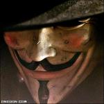
what do u think?
Believe theres harder ones here *looks at bibi and khaled* U_UT_T
lol, u too are hard judge...
=/Believe theres harder ones here *looks at bibi and khaled* U_U


i like it broYou must be registered for see images
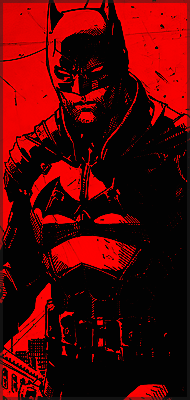
what do u think?
 nice work
lolz if u need help with it feel free to ask=/
this is only my second sig...I got PS two days ago...so don't expect too much of me right now.
Loll, thk, be sure I will!lolz if u need help with it feel free to ask


I'M DAMN PROUD OF IT!! IF IT MAKES PEOPLE CRY THEN IT MAKES ME HAPPY!!! >=] xDBelieve theres harder ones here *looks at bibi and khaled* U_U
nice but too crowded...You must be registered for see images
what do u think?

I understand the idea you're trying to show on the sig, however:
1-characters took too much space
2-you should've made the canvas a bit bigger so it would carry the theme a bit better
3-text sucks as well as the blending options , change it and make the blending better
4-don't rely on animations much on PS, cuz it's not really the best on that =/
all that is my opinion, I get this feeling that someone will come and say: can't you say something nice?!
>.>
I'M DAMN PROUD OF IT!! IF IT MAKES PEOPLE CRY THEN IT MAKES ME HAPPY!!! >=] xD