You are using an out of date browser. It may not display this or other websites correctly.
You should upgrade or use an alternative browser.
You should upgrade or use an alternative browser.
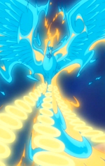
[Gimp] Natsu Dragneel Sig
- Thread starter Luminous
- Start date
More options
Who Replied?
- Joined
- Dec 24, 2011
- Messages
- 11,214
- Reaction score
- 486
great job!
+ rep , there is a weird line , the colouring and shading differentiates on either side of it
+ rep , there is a weird line , the colouring and shading differentiates on either side of it


- Joined
- Aug 16, 2010
- Messages
- 5,276
- Reaction score
- 418
Nice, I like it despite not being a fan of FT. xD
CnC: it feels a bit empty on the right-side. Perhaps the text could be larger, or you could fill the empty space with more effects/renders?
CnC: it feels a bit empty on the right-side. Perhaps the text could be larger, or you could fill the empty space with more effects/renders?

Luminous
Member
- Joined
- Apr 26, 2013
- Messages
- 165
- Reaction score
- 44
Thanks, will try to improve and make better ones next time.Nice, I like it despite not being a fan of FT. xD
CnC: it feels a bit empty on the right-side. Perhaps the text could be larger, or you could fill the empty space with more effects/renders?