Hello there. Last three days I hadn't Internet at all, which was a gud thing cause I was able to hurry up xd I had very little distractions xd
So here is my recent stuff:
More crappy paintings:
So...this time the topic of the paintings were quantitative contrast and complementary colors.
1.
2.
3.-in progress-
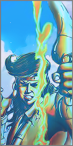
A preview on a character for a new comic I'm working on:
Thoughts?
--------------------------------------------------------------------------------------------------------
For the ones that don't know why the hell I draw squares to paint them later xd, it's my sister's homework...so that's what she was asked to do.
What is that suppose to represent?
They represent the proportion between each pair of complementary colors:
In the first painting the yellow is in a proportion of 3 squares per 9 of purple in each line of squares.
In the second painting, the orange is in a proportion of 4 squares per 8 of blue...
And in the last the red will be in a proportion of 6 squares per 6 of green.
That's suppose to be the right proportion to combine the complementary colors.
So if you ever color something...remember that the proportion for each pair of complementary colors....
So here is my recent stuff:
More crappy paintings:
So...this time the topic of the paintings were quantitative contrast and complementary colors.
1.
You must be registered for see images
You must be registered for see images
You must be registered for see images
You must be registered for see images
You must be registered for see images
You must be registered for see images
You must be registered for see images
--------------------------------------------------------------------------------------------------------
For the ones that don't know why the hell I draw squares to paint them later xd, it's my sister's homework...so that's what she was asked to do.
What is that suppose to represent?
They represent the proportion between each pair of complementary colors:
In the first painting the yellow is in a proportion of 3 squares per 9 of purple in each line of squares.
In the second painting, the orange is in a proportion of 4 squares per 8 of blue...
And in the last the red will be in a proportion of 6 squares per 6 of green.
That's suppose to be the right proportion to combine the complementary colors.
So if you ever color something...remember that the proportion for each pair of complementary colors....
Last edited: