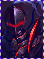
i really like the first one
the colors you used are awesome
the rule of thirds was a great choice for that sig :y
the focal is good :y..maybe you can darken the edges slightly around the left to make the render pop out a little more
and to improve it a little more, you can add gradients in soft light and decrease the opacity :y
as for the text, the font is a good choice, but just doesnt seem like alot of work was put in it, im still learning how to make text compliment my sig, so i shouldnt be talking haha
overall, i really like that sig :y awesome job
......................................
as for the second sig, the render doesnt blend in very well with the BG,
adding a gradient to the render layer(not sure which layer mode xd) and decrease the opacity
burning the edges of the render some can also make it blend a little more :y
thats about it

=DD
the sigs are really nice man :y
keep up the great work