[Photoshop] mugiwara no luffy signature
- Thread starter Chihaya
- Start date
More options
Who Replied?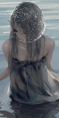


Awards


Ootsuki Hagoromo
Member

Awards


+ text is cool
+ the focal point is clear
-i guess i would say it's too simple but that may have been the desired effect
-the circle effects on the left hand side take away from the focal point (a little bit)
i cant really criticize colour
overall i think it looks pretty cool")
+ the focal point is clear
-i guess i would say it's too simple but that may have been the desired effect
-the circle effects on the left hand side take away from the focal point (a little bit)
i cant really criticize colour
overall i think it looks pretty cool


Well she said almost everything I wanted to say, I am just going to add that IMO needs alittle more colors and the brush with the small text, should be used only once, because either else it loses it's effect.+ text is cool
+ the focal point is clear
-i guess i would say it's too simple but that may have been the desired effect
-the circle effects on the left hand side take away from the focal point (a little bit)
i cant really criticize colour
overall i think it looks pretty cool