You are using an out of date browser. It may not display this or other websites correctly.
You should upgrade or use an alternative browser.
You should upgrade or use an alternative browser.
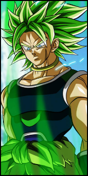
Mass Effect: Commander Shepard Sig
- Thread starter Raiin
- Start date
More options
Who Replied?- Joined
- Jan 8, 2013
- Messages
- 537
- Reaction score
- 34
Awesome!
You must be registered for see images

- Joined
- Jul 4, 2012
- Messages
- 8,222
- Reaction score
- 661
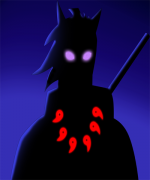
cool
but the dark edges on the right kinda mess up the lighting O_O
also it needs depth..its really important >_O
everything else looks good...but it needs a focal...
one way to do that is by working around the render...and making effects kinda go toward the render...but feel free to use different method..the one i mentioned is kind of a easy one xD
- Joined
- Dec 17, 2012
- Messages
- 711
- Reaction score
- 69
Nice, I for one like the shadowed vignette thing.
")
Raiin
Member
- Joined
- Dec 29, 2012
- Messages
- 489
- Reaction score
- 67
Alright lad.
You've def improved from the last tag, which i'm glad for. Since that means my critique and feedback where used
Atleast with effects.
Alright, what i still miss is depth and there is a big lightning miss on this one, but i'll come back to you with that one later.
Thing is that now that there is a bg and a render, you really gotta make them melt together somehow. I advice you to download some C4D packs, which can be foundYou must be registered for see links. Here's also aYou must be registered for see linksfor that. Very effective way to make effects that circle around the render/focal. That makes it blend much, and give a relaxed feeling for the eyes. If the depth is right ofc. Here's also a niceYou must be registered for see linksfor blending and depth. It's for photoshop and gimp, so i hope it works fine.
Alright, the lightning is very strange here. Look at the render. He clearly has a red reflection on the other side of his face/head than the lightsource is comming from. Also there is no lightsource that is shining from that direction in the tag so. Looks like a bit of a fail there xd.
There's only one colour here. That is red, since black and white aren't actually colours. However you've mixed them well, which isn't kinda hard with a grayscale >_O.
Add a border. I don't really know how to do that in gimp. I suggest you google that .
Anyway, great improvement from last time. Now there is what i mentioned, and add a text/logo that is missing for the next one. Also always check on the render if there is a reflection on it. Then make a lightsource that is realistic for it. So it really matches the direction of light.
Goodluck ^^
Those tutorials really helped, thanks man!