Magi Signature
- Thread starter Gintõki1
- Start date
More options
Who Replied?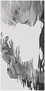


")


Lets see...
First of all,the signature looks empty.Kust look at the bottom or top left corner,there are too much dark space.
Second,lightning is dull.Soft white light doesn't look good enough to me,same goes to whole color palette.More colors,adjustment layers and probably fractals neede to add crisp and tachy look to the tag.
Text is mehhh,at your current level it's better to leave it simple and be careful with sub texts,you placed yours too far from main text.
Anyway,nice attempt.Keep trying.

Awards
I agree and also the text placement is aweful, may as well have put it in a corner, it should he much closer to the vocal.Lets see...
First of all,the signature looks empty.Kust look at the bottom or top left corner,there are too much dark space.
Second,lightning is dull.Soft white light doesn't look good enough to me,same goes to whole color palette.More colors,adjustment layers and probably fractals neede to add crisp and tachy look to the tag.
Text is mehhh,at your current level it's better to leave it simple and be careful with sub texts,you placed yours too far from main text.
Anyway,nice attempt.Keep trying.

Awards


i agree with hei. you should also look into the rule of thirds to help with text placementLets see...
First of all,the signature looks empty.Kust look at the bottom or top left corner,there are too much dark space.
Second,lightning is dull.Soft white light doesn't look good enough to me,same goes to whole color palette.More colors,adjustment layers and probably fractals neede to add crisp and tachy look to the tag.
Text is mehhh,at your current level it's better to leave it simple and be careful with sub texts,you placed yours too far from main text.
Anyway,nice attempt.Keep trying.