CnC's as it's been a while i did last time...
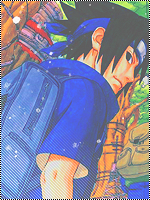
First thing i noticed is the the fact that you used the exact same brush sizes/brushes on both sides, just flipped horizontally.. Not very nice, since it looks very cheap then. Also not very well blended, you could've blended way better with the render now that it was a cloud/air signature. Look at mine, and see what i mean.
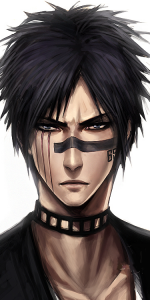
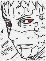
Could've given some perks to the render, maybe glowing Sharingan eyes(again like mine), some kind of lightning also.
Colours are a slightly depressing(well it's a depressed character, but anyway). Put something light in it aswell.
Banner is ok, but it's just that you've only used one fractal as it's bg not used anything else. It looks ok, but nothing more. Text is horrible like.. You need to download some cool fonts, also i recommend trying out 3D text's(like mine aswell).
You must be registered for see links
.
Sharingans aren't blended into the banner, which they should be. Also looks very "pasted" in there without much effort trying to blend them in. Don't like the lightning reflections on them, and they could've looked more outstanding than they do.
More effects, more blending, more effort overall should be done.
Also a tip, if you want your banners to keep moving send them to Lawliet, she can fuse your signature and banners.
(Pm her your signature and banner you want fused, and by fused i don't mean fused into one file and loss of quality, i mean fused as in of use. Also like mine).
Goodluck, and keep GFX:ing
")