[Photoshop] Madara Uchiha
- Thread starter Anduril
- Start date
More options
Who Replied?


Awards

Uchiha Yamacha
Member


Awards


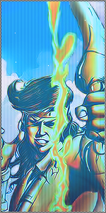
The focal isn't clear enough, my eyes are getting drawn away from the actaul madara render to the left where your text is, instead of looking at a focused point in the sig im looking at the whole thing alll the time, thus it doesn't feel like its got much depth.
Its pleasent to the eye, but it reminds me more of a wallpaper or even stock or something not a signature.
Its pleasent to the eye, but it reminds me more of a wallpaper or even stock or something not a signature.