So I finally got my hands on a tablet and decided to give lineart colouring another try. Last time I did one was 4 years ago and with a mouse so it was kinda shit hahaha. Anyways, here's my first proper attempt. Dunno who the character is so I used random colours so no hate plz.
CnC would be appreciated (especially shading tips thanks)
Eyes and hair were rendered nicely. I like the soft shading on the skin too.
This isn't bad at all, it's quite good. Once you get more familiar with the stuff/develop new styles/skills I'm sure stuff'll look a lot more pleasing. Keep it up
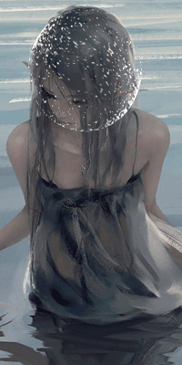
This is really good. Way better than I could ever do! I do have some advice on the shading though. Instead of using grey use a darker color of the skin color, or a dark pink/peach color. For example, this girls neck shading is not grey but a darker skin color:
You must be registered for see images
Also, as I learned in art class, pick a point in which the sun is. And stay consistent with that as it laysout where the shading will come from. This is important for the face shading in my opinion. Like, if the sun is shinning from the right, put a small dot you can erase later in the right corner. Then shade logically and acording to the sun.
And lastly, instead of outlining the face in black, I recommend a nice dark color of the skin tone or a dark grey. Using black takes away from the smoothness and looks unnatural to me. In the example I posted above, her outline is not pure black, but a really dark red or something.
I love shading. Its my favorite part of all my drawings. I hope I helped. Shading is the type of thing you don't want to over do. Looks better with less.. For the face that is.
Eyes and hair were rendered nicely. I like the soft shading on the skin too.
This isn't bad at all, it's quite good. Once you get more familiar with the stuff/develop new styles/skills I'm sure stuff'll look a lot more pleasing. Keep it up
This is really good. Way better than I could ever do! I do have some advice on the shading though. Instead of using grey use a darker color of the skin color, or a dark pink/peach color. For example, this girls neck shading is not grey but a darker skin color:
You must be registered for see images
Also, as I learned in art class, pick a point in which the sun is. And stay consistent with that as it laysout where the shading will come from. This is important for the face shading in my opinion. Like, if the sun is shinning from the right, put a small dot you can erase later in the right corner. Then shade logically and acording to the sun.
And lastly, instead of outlining the face in black, I recommend a nice dark color of the skin tone or a dark grey. Using black takes away from the smoothness and looks unnatural to me. In the example I posted above, her outline is not pure black, but a really dark red or something.
I love shading. Its my favorite part of all my drawings. I hope I helped. Shading is the type of thing you don't want to over do. Looks better with less.. For the face that is.
Thanks for all the advice! I'll put it to good use next time :') For the shading I did use a darker colour than the base colour (so no grey scale shading hahha) but I guess the colour I chose was a bit off huh
I think it looks good, I feel the shading needs a bit more work in terms of looking more natural but other than that the rest looks amazing especially the hair KIU
Finally! Someone takes interest in coloring, where were you when the coloring contest was missing members LoL!! jk jk
OT: Well you've clearly covered the basics there, so good job there, the color is filled well, and the hair is nicely done, though a little more work wouldn't hurt
The eyes are spectacular! Captivating, and it should, the eye should always attract the observer as yours has done, but the major issue would be the shading. Always use darker shades in places like below the neck to give dimension and more depth to the paining
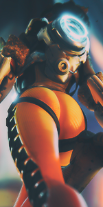
IMPORTANT: Mind your light source. Remember there is no shade really, but where light do not reach, also this second part is important. and I can't stress it enough, there are almost always two different light falling on an object, I call it main light and back light. There's a way different objects, especially human figure interact with light, I can't remember the term as of now though._. but perhaps a picture will explain better
You must be registered for see images
Notice the right side of the image, and the chin, you see it?
anyways, I'm off to sleep, I'll be happy to torture teach you some tricks, when I'm not this sleepyxd
Finally! Someone takes interest in coloring, where were you when the coloring contest was missing members LoL!! jk jk
OT: Well you've clearly covered the basics there, so good job there, the color is filled well, and the hair is nicely done, though a little more work wouldn't hurt
The eyes are spectacular! Captivating, and it should, the eye should always attract the observer as yours has done, but the major issue would be the shading. Always use darker shades in places like below the neck to give dimension and more depth to the paining
IMPORTANT: Mind your light source. Remember there is no shade really, but where light do not reach, also this second part is important. and I can't stress it enough, there are almost always two different light falling on an object, I call it main light and back light. There's a way different objects, especially human figure interact with light, I can't remember the term as of now though._. but perhaps a picture will explain better
You must be registered for see images
Notice the right side of the image, and the chin, you see it?
anyways, I'm off to sleep, I'll be happy to torture teach you some tricks, when I'm not this sleepyxd