[Photoshop] Lightbeauty (2nd ps sig)

Powerflames

Member
Joined
Jul 10, 2012
Messages
290
Reaction score
168
UHHHHHHHH! So sharpened U_U
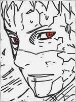
Well, made a 2nd sig on ps U_U
Tried to aplly the colors better but it ended up looking to sharpened :/

Well here goes nothing ^^

Text:
You must be registered for see images

No text:
You must be registered for see images

CNC PLEASE :eek:
 

Anbu578

Anbu Operative 🎭
Veteran
Joined
Dec 6, 2009
Messages
3,387
Reaction score
56
I find these pretty good but I was slightly distracted by the swirls but overall pretty good
 

Chaos.

Jōnin Strategist 🧠
Regular
Joined
Sep 21, 2011
Messages
1,845
Reaction score
429
BG is so weird i have nothing to say.........you used distort or whatever to make the circle effect and it isnt looking nice....It has a good part,i have to admit,i like the render position,but apart from that i would suggest y to look for a tutorial for ps users.Oh and it isnt that much sharpened(which is another good except from positioning)...
 

Yuka

Sannin of the Scrolls 📜
Elite
Joined
Aug 29, 2011
Messages
6,485
Reaction score
1,056
i like the one with out text better but that's just my personal opinion anyways Nice work :)
 
Top