Awards
You must be registered for see images
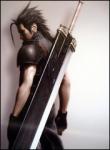
Tried smth new...


He is saying a lot of people use that style, thus highlighting his style's uniqueness and superiority to people who use tutorials.thats completely new for me....
Thats my first with tht style..


ThanksHe is saying a lot of people use that style, thus highlighting his style's uniqueness and superiority to people who use tutorials.
oh, i didnt understandHe is saying a lot of people use that style, thus highlighting his style's uniqueness and superiority to people who use tutorials.


even if i would vector it by myself, it wouldnt change its ``coolness`` .. lolyeah, did you vector that urself? if not, it isnt very impressive =/
its LQ, or over-sharpened. cant tell which, but it looks bad
colors dont work.. sorry. and whats with the white dots? they just look bad.
you should ditch the BG, and mabye find a light source. and the text is awful
one final thing, you should consider the balance of your piece before you start. this piece is not balalced at all. it looks akward cuz of that
if you vectored it youself, it would have taken a lot longer, and I would recignize you as a better artist that copying other imageseven if i would vector it by myself, it wouldnt change its ``coolness`` .. lol
So, why u care did i vector it or not.
How the fk colors dont work if they blend with the render??
Balance? What do u mean?
 but thats not a huge problem color combinations should include more intricate swatches. copying the render dosnt look good at all... check out transparents tut somewhere in the tuts section. also look for some tuts online for that stuff