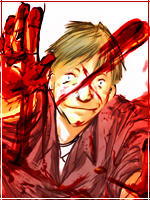
I really like it i thik youve picked out a few things about the actual render and expanded on it like the thingy on the right looks like his scarf thingy but has the same kinda flow as his hair and the jigsaw piece thingys looks as if parts of his armour and his yellow straps is breaking apart i like it simple but very effective
looks as if hes exquiping his armour...really slowly
The whatever-that-thing-is in the text (gradient? clipping mask?) needs to die. Otherwise, this isn't bad. I don't like the effects on the left side. The flow is kinda funky too... the left side is closer to a vertical angle while the right side is closer to a horizontal angle with the effects. It's not that bad, I don't think it was executed too well though. I'm not sure I like how the colors of the effects go with the background. Overall, this isn't really my style of sig...composition is great, so is depth.