You are using an out of date browser. It may not display this or other websites correctly.
You should upgrade or use an alternative browser.
You should upgrade or use an alternative browser.
[Photoshop] Kingdom Hearts | Vanitas Tag
- Thread starter Raiin
- Start date
More options
Who Replied?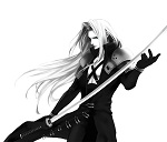
- Joined
- Mar 30, 2013
- Messages
- 2,372
- Reaction score
- 335
Thats Cool! af!!!

Raiin
Member
- Joined
- Dec 29, 2012
- Messages
- 489
- Reaction score
- 67
Thats Cool! af!!!
Glad you like it!
Its great dont get me wrong, but It feels empty to me.
But definitely good job.
Thank You :bouncy:

Raiin
Member
- Joined
- Dec 29, 2012
- Messages
- 489
- Reaction score
- 67
I like how the colors worked together, but it doesn't feel right.
Thank You, whatever that means lol


- Joined
- Jul 4, 2012
- Messages
- 8,222
- Reaction score
- 661
o mai gawd, I love ths!
I'm a sucker for red and black u.u
Some more adjustments wouldn't hurt though. For example, adding a glow on the red parts of his clothing would look awesome; darken the edges of the left side to make the render a better focal, because there's a lot of "wasted" space on the left, maybe you should crop the canvas to help the render become the main focal; definitely make the render blend more with the background; lastly, you should either burn the light glare on his shoulder to better fit the dark theme, or add a light source so that the glare makes sense, because right now I don't see a light source capable of that much reflection @_@.
I appreciate that you're one of the few people that still post signatures rather than avatars signatures are the tough things to make.
Overall I really like this u.u
I'm a sucker for red and black u.u
Some more adjustments wouldn't hurt though. For example, adding a glow on the red parts of his clothing would look awesome; darken the edges of the left side to make the render a better focal, because there's a lot of "wasted" space on the left, maybe you should crop the canvas to help the render become the main focal; definitely make the render blend more with the background; lastly, you should either burn the light glare on his shoulder to better fit the dark theme, or add a light source so that the glare makes sense, because right now I don't see a light source capable of that much reflection @_@.
I appreciate that you're one of the few people that still post signatures rather than avatars
signatures are the tough things to make.Overall I really like this u.u

- Joined
- Feb 14, 2012
- Messages
- 2,044
- Reaction score
- 240
Everything would fit a lot better in smaller canvas since it looks too empty now. Great work on bg and typo tho!