[Gimp] Killer Bee sig.

ThtOneGuy

Jōnin Strategist 🧠
Regular
Joined
Jun 3, 2012
Messages
1,160
Reaction score
141
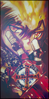
So i just finished making this sig and was planning on using it but it doesnt look right to me. I dont know if the border is to big or the render doesnt pop out or what. I put gyuki in the background and thought it was a good idea but it seems to be taking the thunder off the render which should be the main focus. The rendering isnt to hot either i tried making it better but i just ended up cutting off the photo so i stoppped. Any tips for a better background? Maybe a color background will look better?
You must be registered for see images
 

gordo1

Anbu Operative 🎭
Veteran
Joined
Jun 15, 2012
Messages
4,666
Reaction score
351
I think the background is too blurry for how important it is. I'm not sure if you blurred it on purpose or just used a crappy image, but try making it less blurry if you can. I think you'll like it then.
 

Nikes

Jōnin Strategist 🧠
Veteran
Joined
Nov 26, 2011
Messages
2,477
Reaction score
396
Render is a little sharp, great job and great concept
 

ThtOneGuy

Jōnin Strategist 🧠
Regular
Joined
Jun 3, 2012
Messages
1,160
Reaction score
141
I think the background is too blurry for how important it is. I'm not sure if you blurred it on purpose or just used a crappy image, but try making it less blurry if you can. I think you'll like it then.

i blurred it on purpose
 

Shiina..

Sannin of the Scrolls 📜
Elite
Joined
Apr 24, 2012
Messages
8,985
Reaction score
803
Nicee! Wel done =DD
+Rep :D
 

Narutohokage7

Sannin of the Scrolls 📜
Elite
Joined
Apr 18, 2012
Messages
8,783
Reaction score
935
Awesome sig, would be awesome to see a collection for all the Bijuus and jinks.
 

UchihaxSenju

Jōnin Strategist 🧠
Regular
Joined
Apr 27, 2012
Messages
1,243
Reaction score
110
to me it looks bad

it just looks like a render pasted on a stock that was blurred then added text and a border...

i see no effort put into this like 2-3 mins at most
 

Marcuss

Jōnin Strategist 🧠
Regular
Joined
May 2, 2012
Messages
1,487
Reaction score
146
i dont really like it
maybe try some tutorials?
 

ThtOneGuy

Jōnin Strategist 🧠
Regular
Joined
Jun 3, 2012
Messages
1,160
Reaction score
141
to me it looks bad

it just looks like a render pasted on a stock that was blurred then added text and a border...

i see no effort put into this like 2-3 mins at most

i changed the color settings on both the background and render, added text to the sword then changed the perspective. i added the render on the background then blurred it to make the render pop out a bit more. then i added a black border to the background. i rendered most of the render by myself since i was unlucky and got a bad render. took me around 20 min. dont judge it so easily i was looking for constructive critzim not just saying it was a super easy. what else is a sig besides what you just said, kinda dumb when you say like that considering thats how you make a sig :sy:.
 
Top